Case Study Banner

Summary

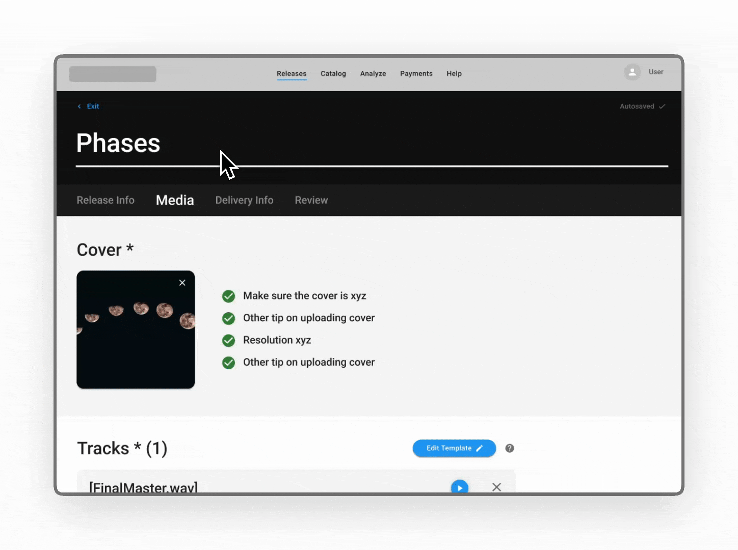
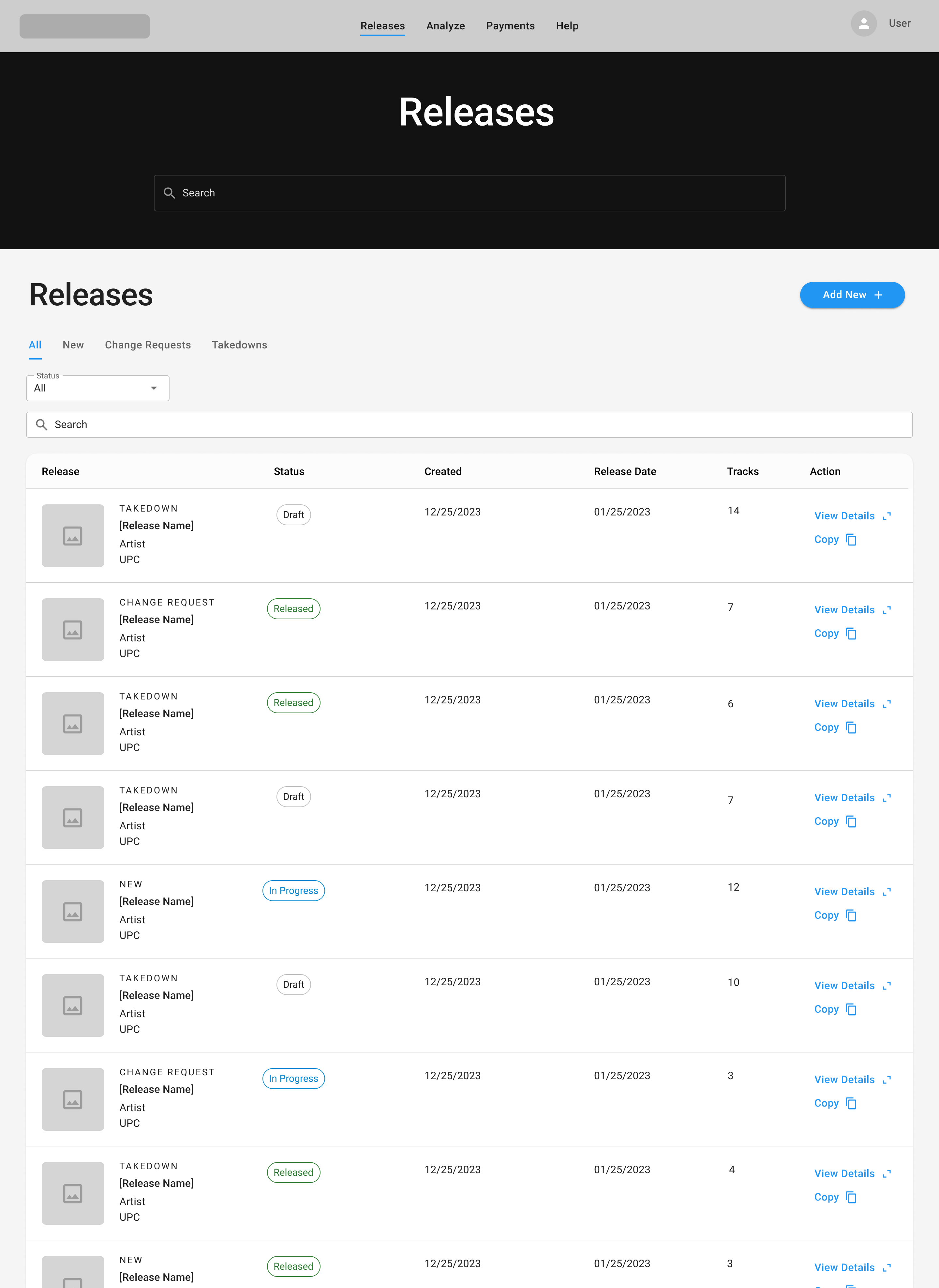
A music distributor is a middleman that allows record labels to upload music and have it sent to services like Spotify, YouTube, and TikTok. A problem that record labels face is that these big distributors take a big cut of artists' and label's revenue. A major record label approached my team with the goal of creating a tool that removes the big middleman and allows them to self-distribute and monitor the progress of their own catalog through robust analytics.

Design System
Style Guide
Product Design
UX/UI Design

Details

Role

Lead Product Designer

Duration

August 2023 - January 2024

Tools

Figma

Team

Case Team Image

Emma McCann

Product Designer
Case Team Image

Crush & Lovely

Strategy & Development
Case Team Image

Rostrum Records

Stakeholders
Case Study BannerCase Study Banner

Challenges

Research Image

0-1

It was up to me to set forth a blueprint for a brand new music distributor with no existing scaffolding.

Research Image

Intricate user journeys

Workflows included multi-step upload flows and monitoring the statuses of releases.

Research Image

Ever-changing statuses

I was tasked to design a tool that took into account several complex states and statuses for pages and components.

Solution

SpaceHeater goes beyond the UX of competitors and is a true tool for its users.

User-centered

SpaceHeater is not tech company telling users what to want out of a distributor. It's centered around catalog owner needs.

Solution Image

Streamlined data

SpaceHeater gets to the root of what analytics record labels and catalog owners need to do their jobs.

Solution Image

Shows... and tells

SpaceHeater is not only a suite of analytics... it's a recommendation engine. It can goes beyond the graphs and focuses on action.

Solution Image

Surveying the landscape

To kick off the project, I launched an extensive discovery phase during which I analyzed existing music distributors. I summarized findings and noted key observations in a presentation for stakeholders. The findings influenced product direction.

Information Arcitecture

Page Structure

Competitor Overview

Feature Chart

Opportunity 1: Actionable insights

A big theme of SpaceHeater is going beyond analytics, and "telling" rather than only "showing".

Competitors

... have analytics that show data, but don't say what to do with that data to get results.

Solution Image

SpaceHeater

...will provide suggestions on how to optimize KPIs, helping users read between the lines of analytics.

Solution Image

Opportunity 2: Lessen fatigue

SpaceHeater will embody organized, user-centered flows.

Competitors

...have long, winding flows with little thought to content prioritization.

Solution Image

SpaceHeater

...will allow users to upload a track in a few steps. Content on each page is organized according to a system.

Solution Image

Opportunity 3: A streamlined tool

Competitor distributors are bloated with marketing tools. SpaceHeater won't try and invent the wheel, instead focusing on providing seamless catalog management and insights.  

Competitors...

offer promotional and marketing tools which don't compete with external tools.

Solution Image

SpaceHeater will...

be a streamlined tool focusing on payments, distribution, catalog management, and analytics/insights.

Solution Image

Choosing a component library

I decided to build designs using an existing component library, Google Material Design, rather than create one from scratch. This helped streamline designer/development hand-off, and allowed me to focus on solving the bigger-picture design challenges.

Validating designs

Users were unable to find change requests on the main releases page. It turns out change requests were actually a type of release, and could be categorized by the same statuses. I decided to combine change requests and releases into one table, and have them be paginated by type of release rather than status. Keeping in close communication with the client and testing early and often helped tame assumptions and center the design around users.

v1

Releases and Change Requests were originally in different tables, sorted by status

v2

User testing and communication with the client revealed a more user-friendly structure.

Navigating tech constraints

In one of our collaboration sessions, I received feedback from the development team that we could speed up production time by eliminating modals in the product. I didn't see this as a huge hinderance to user experience, and found a solution.

Mid-fidelity (modal)

Modals were used across the experience in the mid-fidelity prototype.

High-fidelity (in screen)

I replaced modals with an in-page solution.

Creating rhythm within pages

Record labels have to input album information and provide audio files and delivery information before they release an album. Existing upload flows do not organize content in a thoughtful manner with attention to user experience, so I capitalized on this gap in the market.

Within each page of the upload flow, I categorized form fields into two groups: Primary and Details. Primary form fields must be filled out in order to release an album, and "Detail" form fields are optional. This hierarchy expedites filling out information for releases.

Primary content

Primary content is the bare-minimum content needed to be filled out in order to upload a release. To optimize the upload flow, I prioritized its location on the page.

Solution Image

Secondary content

Secondary content is stored within the "Details" section. Hypothetically, a user could complete a release upload without touching this autopopulated information.

Solution Image

A fluid experience

Competitor's upload flows are rigid, requiring users to fill out all form fields on a page before moving to the next step. We designed an upload flow that allows users to move freely from page to page, autosaving information as they go. Users can review missed fields and errors on the review page of the flow.

Error correction

The last step of the upload flow is a review page that lists the errors needed to be corrected in order to submit the release.

Freedom to skip

Users can skip certain sections and return to them later.

Streamlining intricate forms

Simplicity in color choice helped to focus user attention on completing complex flows.

A browsable catalog of music

By interviewing catalog owners we uncovered their need to see as much of their catalog as possible at one time to glean its overall health. We looked to WINAMP, the classic early 2000s media software, as design inspiration for the platform's catalog, adding to data scan-ability.

Minimalist analytics

One of my tasks was to design a style guide for the platform's suite of analytics tools. To prevent visual noise and allow the data to shine, I took a minimalist approach to UI design. Every element included in the interface has a function.

I modified the brand palette to create a color palette for data. The brand calls for the motif of fire, and I communicated this by crafting a quantitative palette that assigns larger values to warmer colors.

Case Study Banner

Actionable AI insights

A differentiator of the SpaceHeater platform is it not only show analytics about one's catalog, it incorporates actionable AI insights on how to act upon data. Following the UX principle of Jakobs Law, I applied light "AI-infused" branding to the platform when that technology was used.

Pioneering music distribution

The product was launched early 2025 to critical praise. Using the design system set forth the team was able to integrate new AI functionality into the experience to further elevate it for catalog owners.  

Read Article