Case Study
Increasing station editing efficiency by 25%
Status
Shipped
Contribution
Lead Product Designer
Year
Q1-Q4 2024
Team
3 Engineers, 1 PM, me
Overview
Feed.fm is a B2B2C company that handles music licensing for its clients— apps who stream music. Consequently, feed.fm has an internal team of music curators crafting playlists for these apps. The internal platform that handles curation, called the Ops Portal, called for new features and UX/UI optimizations. I worked with Feed's Head of Product to redesign the portal, allowing curators to easily identify problem tracks, add new tracks, and edit station metadata with ease— all with the goal of increasing efficiency by 25%.

Feed.fm's API workflow: curators create playlists that are delivered through their API to apps for seamless music streaming
Problem
I met with my team who had gathered research into the curator's experience using the Ops Portal:
User issues
Feed.fm's existing station editing platform was hindering curator productivity due to inefficient workflows, limited data visibility, and a modal-heavy interface that disrupted the natural flow of playlist management tasks.
Business impact
Slow editing processes were affecting content quality and curator satisfaction, potentially impacting client retention and the company's ability to scale their music curation services effectively.
Opportunity
How might we redesign feed.fm's station editing interface to increase curator efficiency while accommodating complex data manipulation workflows and extensive metadata requirements?
Challenges

Granular UI
The Ops Portal has statuses, icons, alerts for various aspects of the product.

Complex workflows
Curators need to manipulate data in several ways in order to bring relevant information to the forefront.

Lots of metadata
The platform takes into account 1,000+ tracks per playlist.
Solution
Dynamic
The new design champions responsive panels and progressive disclosure: showing users what they need to see depending on their journey.

Space-saving
The new design uses visual shortcuts to make room for new features and information.

Streamlined workflow
By creating a dynamic, space-saving interface we were able to streamline curator's complex workflows.

Assessing the initial product
The initial product utilized the full width of the platform for track information. There was no spot on screen for detailed track metadata. What stood out to me was the lack of any vertical navigation.

The original feed.fm interface showing the full-width table layout that maximized data display but lacked dedicated space for detailed track metadata and vertical navigation
Key observations
- • Full-width table layout maximized data display but limited detailed metadata visibility
- • Absence of vertical navigation reduced spatial organization options
- • Track information was comprehensive but lacked hierarchical structure
- • Interface prioritized data density over user workflow efficiency
A new paradigm
The existing ops portal relied heavily on modals for viewing track information and for the "add a track" flow. I flagged this as a potential issue with the team, as it's easy to fall into the "modal on modal" trap. My philosophy is that modals should be reserved for quick user decisions, and shouldn't encompass entire main workflows of a product.
The initial platform relied heavily on modals

I re-envisioned the platform so main flows could take place in the main interface, reserving modals for quick user decisions.
Design philosophy
- • Modals should be reserved for quick user decisions and confirmations
- • Main workflows should not be confined to modal interfaces
- • Avoid "modal on modal" patterns that create navigation confusion
- • Prioritize inline editing and contextual interfaces for complex tasks
Testing assumptions
To validate our design decisions and ensure the new paradigm would truly improve user workflows, I conducted comprehensive user testing sessions with feed.fm curators. These sessions revealed critical insights about user behavior patterns and helped refine the interface before development.

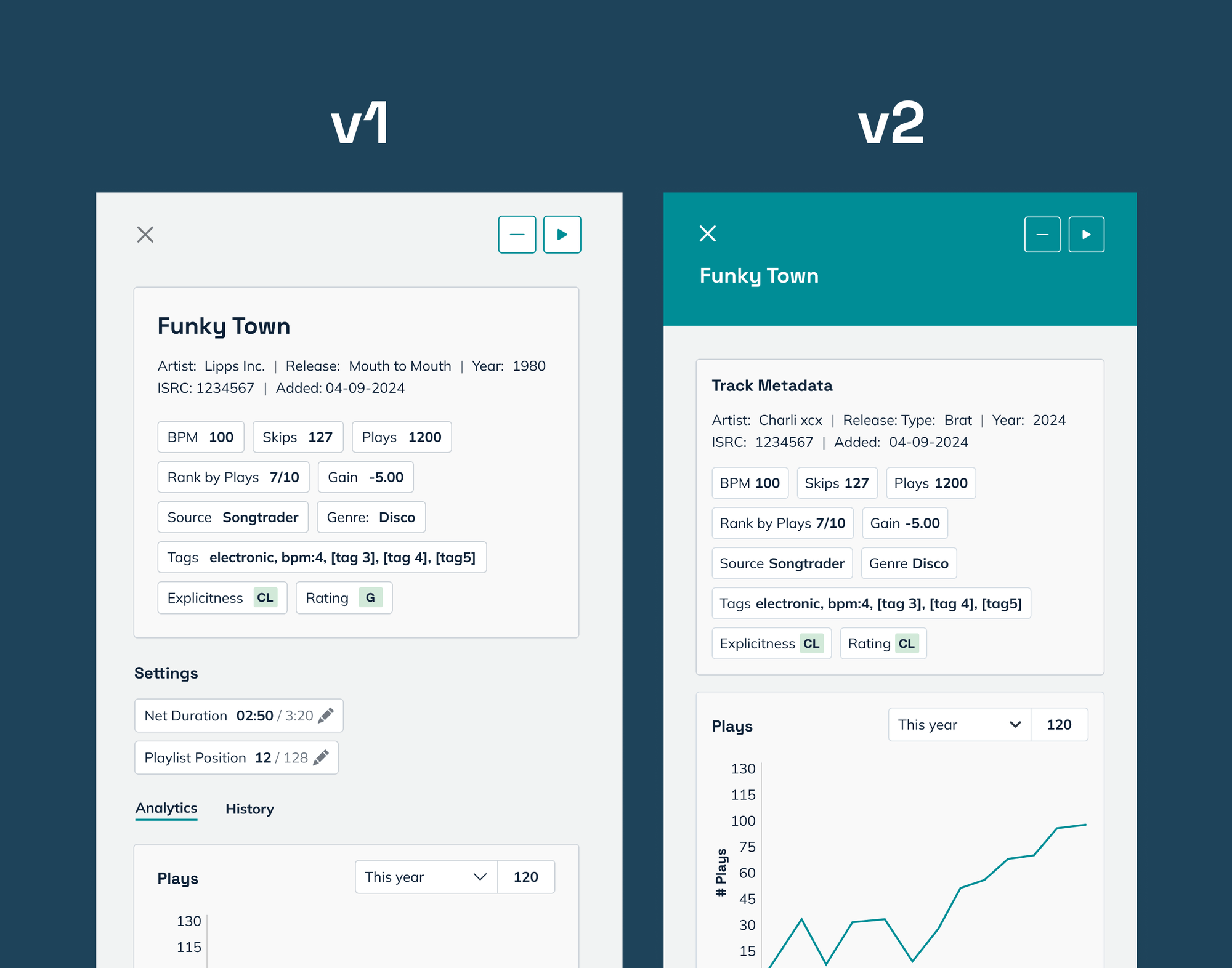
Flow 1: Analyze the track "Apple"

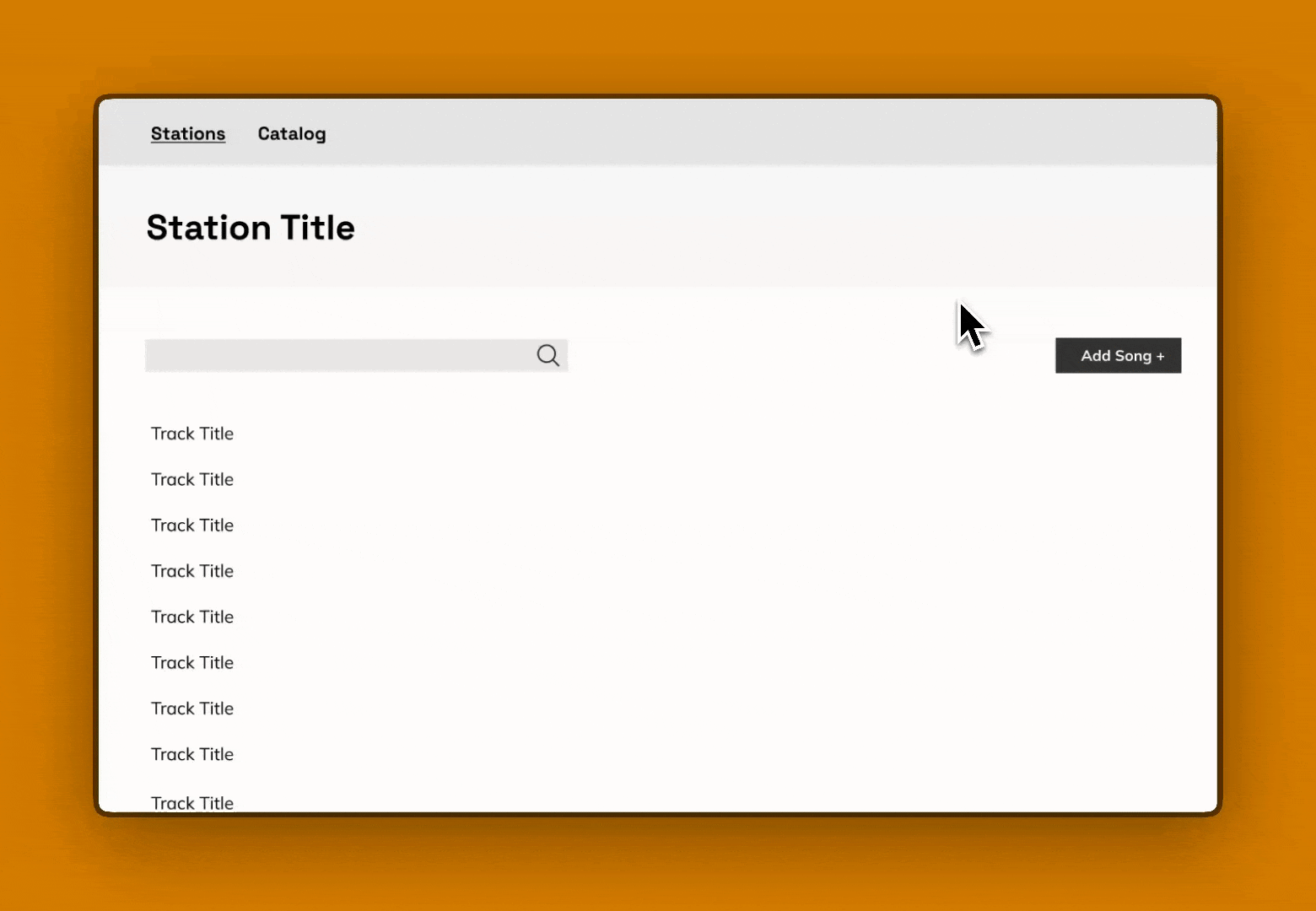
Flow 2: Add the track "Funky Town"

Flow 3: Managing station metadata and filtering settings
Key testing insights
- • Users completed playlist creation tasks 60% faster with the new interface
- • 95% of participants preferred the integrated Station Detail panel over modal workflows
- • Search and filtering functionality reduced cognitive load and improved task accuracy
- • Real-time analytics integration was identified as the most valuable new feature
Prioritizing features
After user testing three flows I cataloged both curator requests and issues. I worked with Feed's Head of Product to prioritize updates from 1 (Must Have) to 4 (Wish).

Curator requests prioritization matrix showing feature requests categorized from 1 (Must Have) to 4 (Wish)

Issues prioritization matrix cataloging curator-identified problems and their criticality levels for resolution
UI updates
Overall, curators were able to grasp the overall gist of each flow. But based on feedback we were able to execute some UI updates to the interface to correct for trip ups.
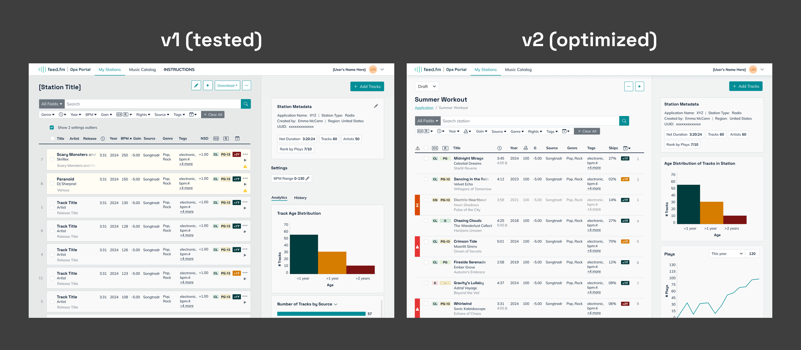
Enhanced track panel with teal header for improved visibility and better information architecture
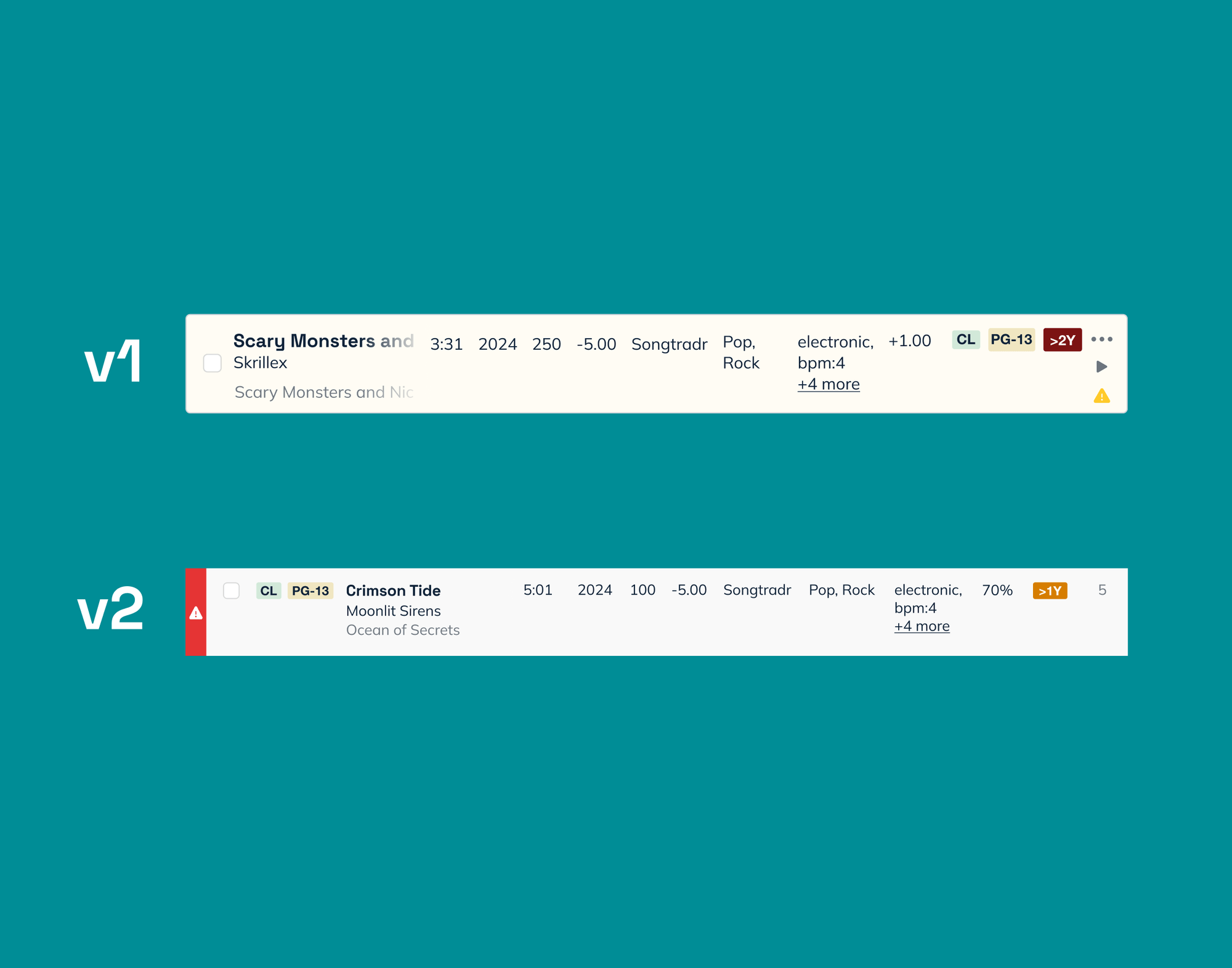
Station outlier alerts updated from yellow to red for better visual cues and immediate recognition
Key UI improvements
- • Added teal track header to make track panel opening more obvious to users
- • Changed station outlier alert color from yellow to red for better visual distinction
- • Enhanced metadata panel layout for improved information hierarchy
- • Refined analytics chart positioning and sizing for better data visibility
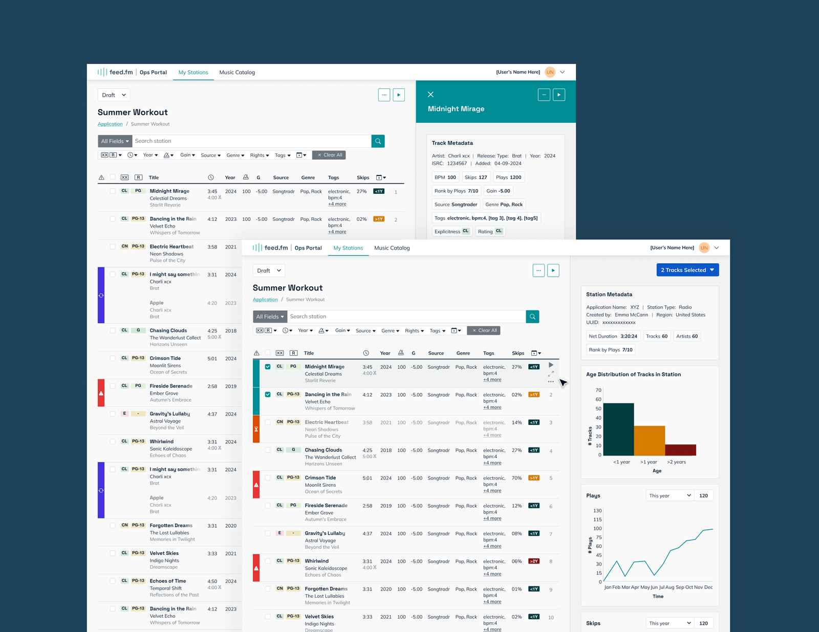
Introducing the dynamic panel
The existing station edit design was static. I introduced a dynamic panel that updates according to where the user clicks on the screen, providing contextual information. For example, when a user clicks on a track in the table, track information updates in the dynamic panel. Similarly, when a user clicks the "Add track" button, Feed's catalog populates the dynamic panel, allowing users to select and add tracks to the station:
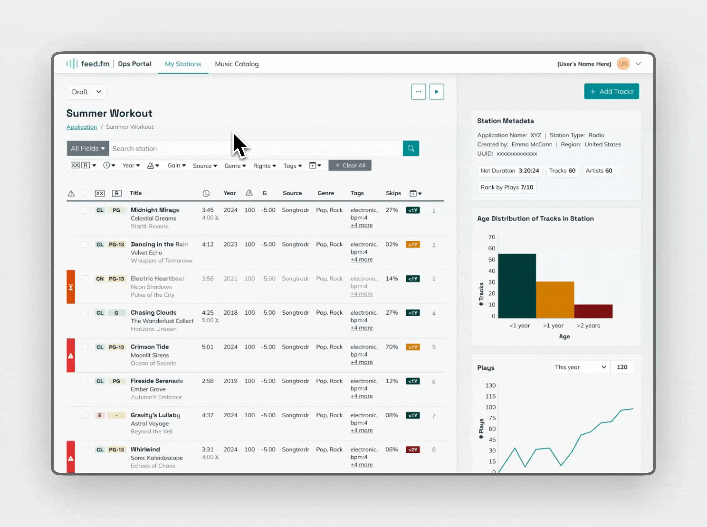
The dynamic panel updates contextually based on user interactions, showing relevant information like station metadata, track details, and analytics
A more efficient way to work
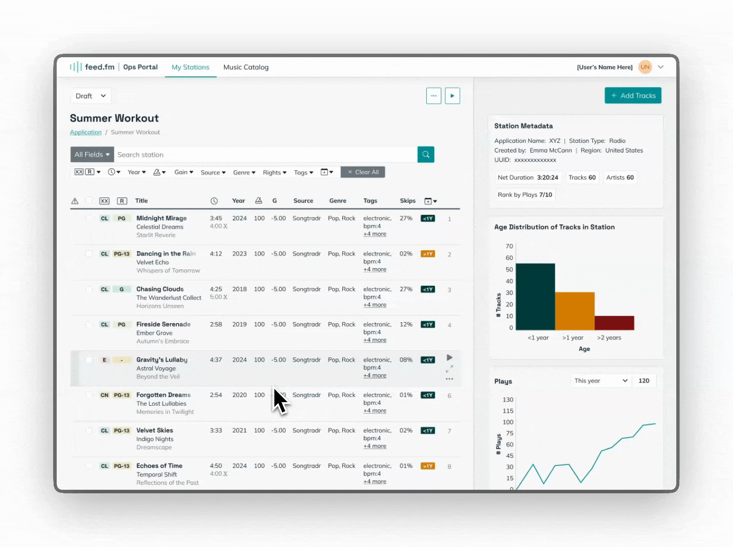
I designed an icon-based alert column in the track table that allows curators to sort through error, placeholder, and autoreplaced tracks.
Previously, curators didn't have an efficient way to bring these types of tracks to the top of the pile to take inventory and make edits to them.
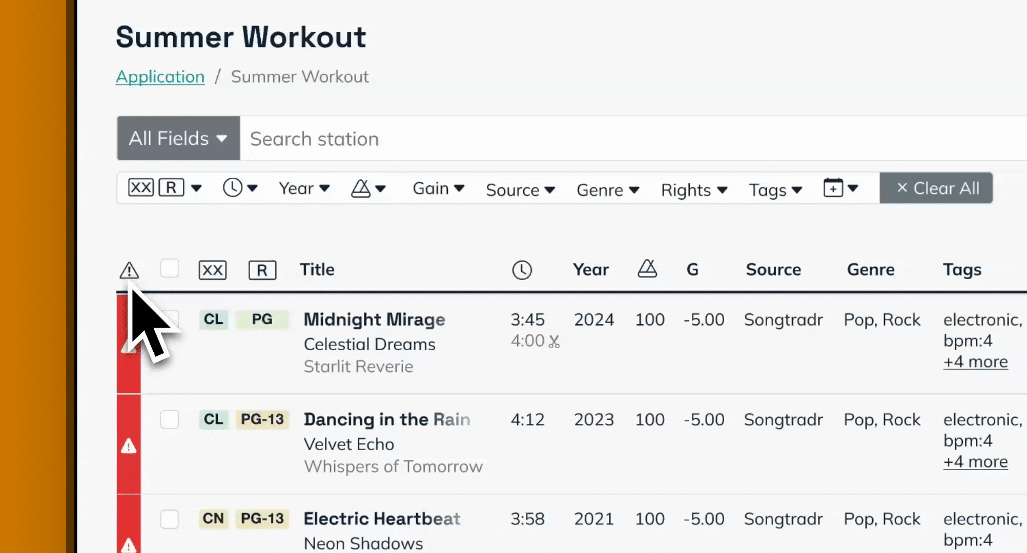
The Summer Workout station interface showing the alert column in action, allowing curators to quickly identify tracks that need attention
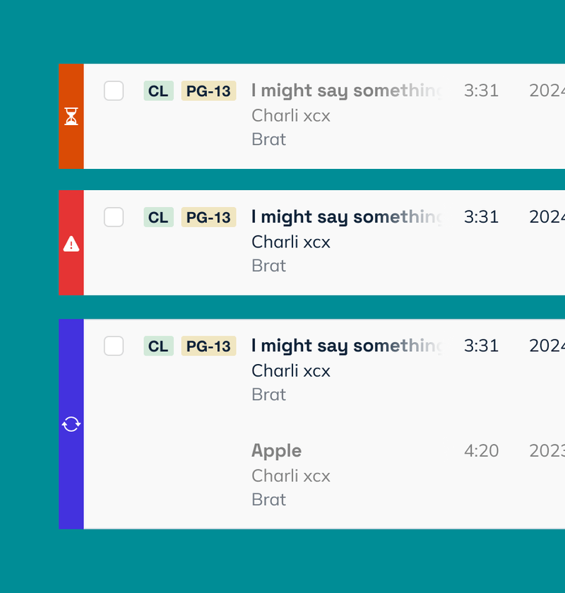
Clear visual demonstration of the three alert states: Placeholder, Alert, and Autoreplace tracks with their distinct color coding and iconography
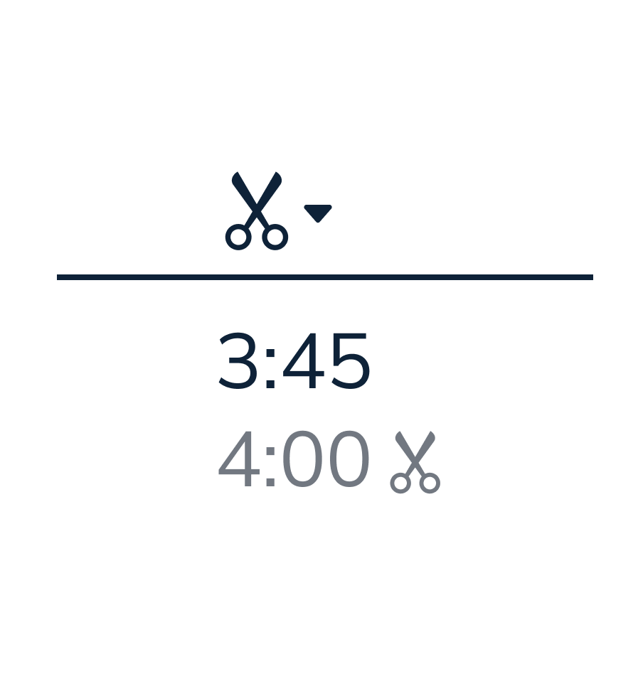
The track trimming interface allows curators to efficiently set start and end points for tracks without leaving the main workflow
Thoughtful interaction design
In order to conserve screen real estate I harnessed the principle of progressive disclosure, only revealing track action buttons on hover.
Progressive disclosure in action: track action buttons only appear on hover, conserving valuable screen real estate while maintaining full functionality
Development hand-off
I took detailed notes in Figma going over hover states, templates, responsiveness breakpoints, and key user flows. I was on hand to answer developer questions as we imported components into Storybook.

Comprehensive component states documentation in Figma, detailing all interaction patterns and hover states for developer implementation

Detailed user flow documentation with specific notes on sorting behaviors and interaction patterns for seamless developer handoff
Results & impact
The redesigned Ops Portal launched in early April 2025 to much excitement from the Feed team. The goal is to increase station editing efficiency by 25%.

Team announcement of the Ops Portal launch showing excitement and engagement from the Feed team
Takeaways
If I could approach this project again, I would have user tested the curators much earlier in the design process. Instead, there was significant back-and-forth about which features to prioritize, and for a considerable time the design was based on assumptions rather than validated user insights.
I'm proud that I advocated for a round of user testing—even though it wasn't in the original scope—because it ultimately grounded the redesign in real curator needs and unlocked far better outcomes.