Case Study
Sculpting an analytics platform MVP
Status
Shipped
Contribution
Lead Product Designer
Year
Q3 2025
Team
1 Engineer, 1 PM, me
Overview
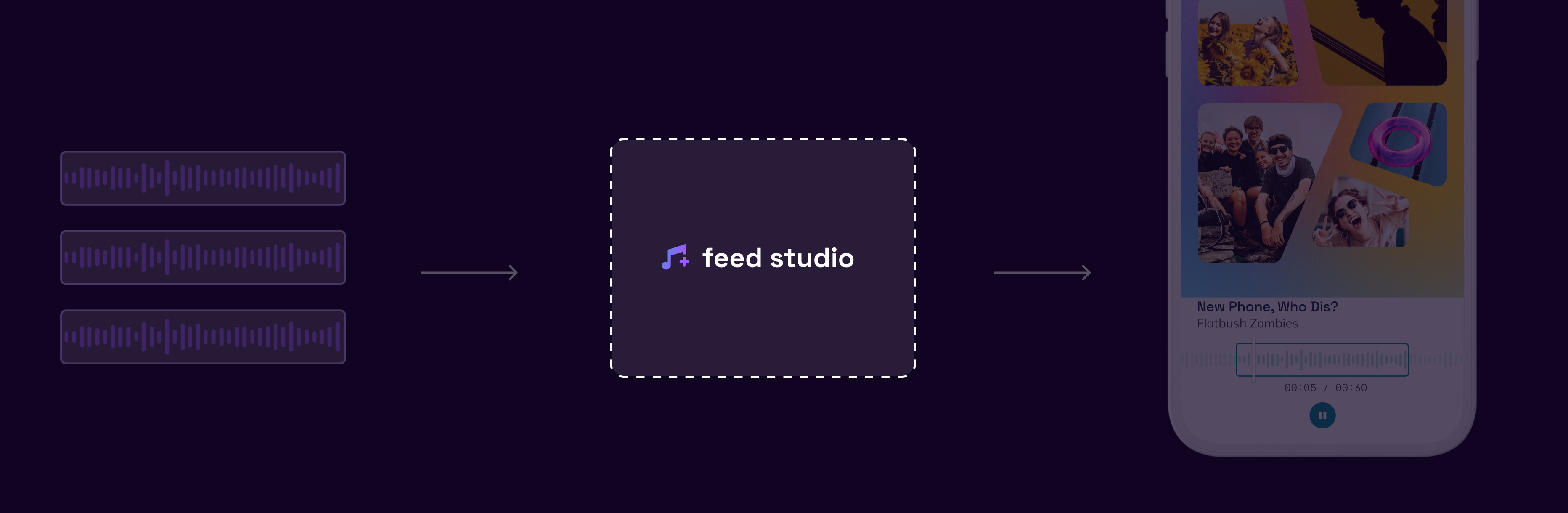
Feed.fm is "The easiest way to add popular music to your app, legally". They take care of music licensing and curation for their clients: apps who stream music. Feed's newest product offering is "Feed Clips", shortened snippets of music that users can attach to their content. I worked closely with developers and a project manager to bring Feed Studio, the interface of Feed Clips, to life.
1. Feed licenses 30-second music clips
2. Feed's clients integrate clips
I designed the interface linking Feed Clips and client apps
User needs
Developers
Development teams needed a way to get API info in order to integrate Feed Clips with their apps.
Stakeholders
Business stakeholders required clear metrics and analytics to measure the success of Feed Clips when integrated into their products.
Business goals
Feed wanted to be quick to market with Feed Clips to capitalize on the growing demand for short-form audio content integrations. The platform needed to serve as both a functional tool and a powerful marketing vehicle to showcase new music clips, demonstrating the value proposition to potential enterprise clients.
Opportunity
How might we demonstrate Feed Clips' value proposition to potential clients while maintaining our rapid time-to-market goals and delivering essential functionality for both developers and stakeholders?
Solution
Systems-based
The new design champions responsive panels and progressive disclosure: showing users what they need to see depending on their journey.
Lean
I kept the development schedule on track by chiseling out only the core features based on our strongest assumptions about user needs. This lean approach allowed us to ship quickly while leaving room to iterate based on real usage data.
Laying solid groundwork
I sat down with the developer and project manager to talk through the technical side of things. The developer was really excited about using Material-UI (MUI) for the interface components because they'd worked with it before and knew it was reliable and well-supported. I got to setting up a component library that could be used not only for this product, but additional products down the line.
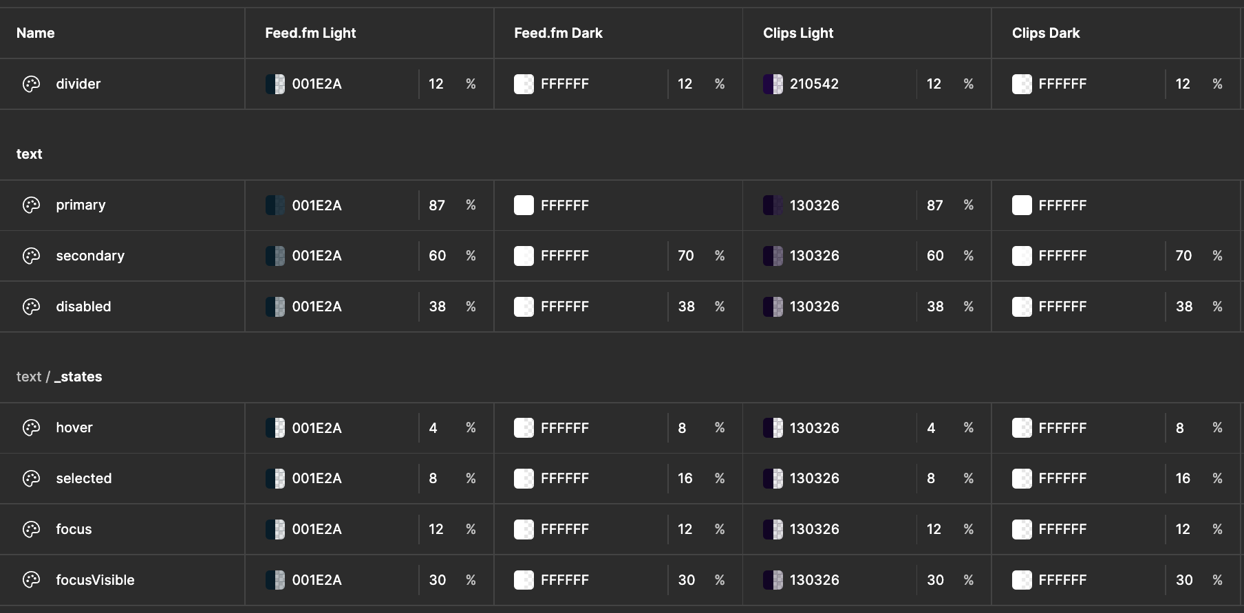
The design tokens I set up in Figma using MUI's system as a base

Button component system documenting all states, sizes, and variants to ensure consistency across the platform
Identifying assumptions
I had a kickoff meeting with the project manager who came to me with a Lovable mockup they'd put together. Looking at the mockup, I identified that the dashboard and analytics sections would benefit from user interviews and more comprehensive user data. While the basic structure was solid, these areas contained assumptions about what metrics would be most valuable to stakeholders. I knew we'd need real user insights to make these sections truly effective.
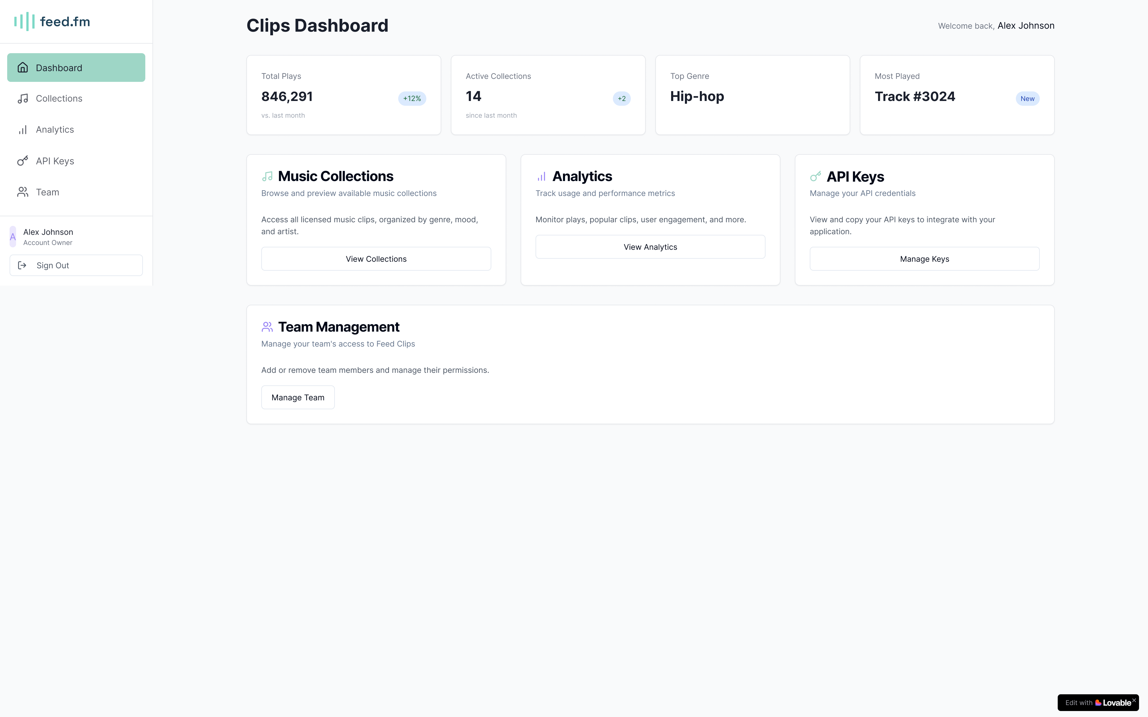
Initial prototype of dashboard showing key metrics, active collections, and navigation to different platform sections
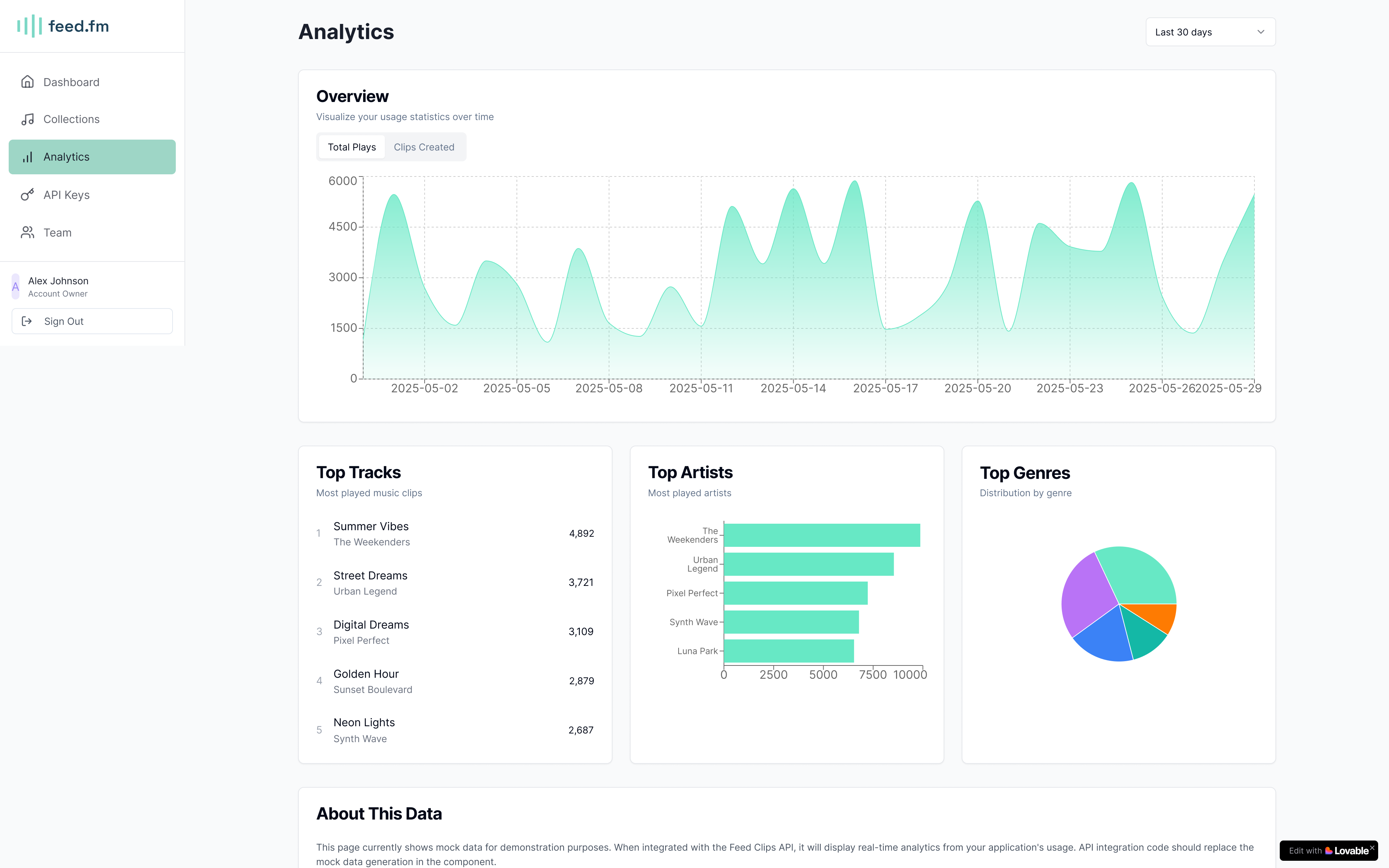
Initial prototype of analytics dashboard with usage statistics, top tracks, and performance metrics
Advocating for user testing
I advocated for user interviews focused on the analytics dashboard, recognizing that our assumptions about what metrics would be valuable to stakeholders needed validation. I learned that the strategy was to just get an MVP out in the world first. Knowing this helped me shape design strategy.
.png)
Slack conversation with the Head of Product about the importance of user research for the analytics dashboard
Getting lost in the stats
There were so many different ways to visualize and measure Clips. Everyone had an opinion of what should be included—from engagement metrics to usage patterns to performance analytics. With limited information known about user preferences, I knew we had to keep things lightweight and build upon only what we knew so far. The challenge wasn't just choosing which metrics to display, but resisting the temptation to over-engineer a solution before we had validated what actually mattered to our users.
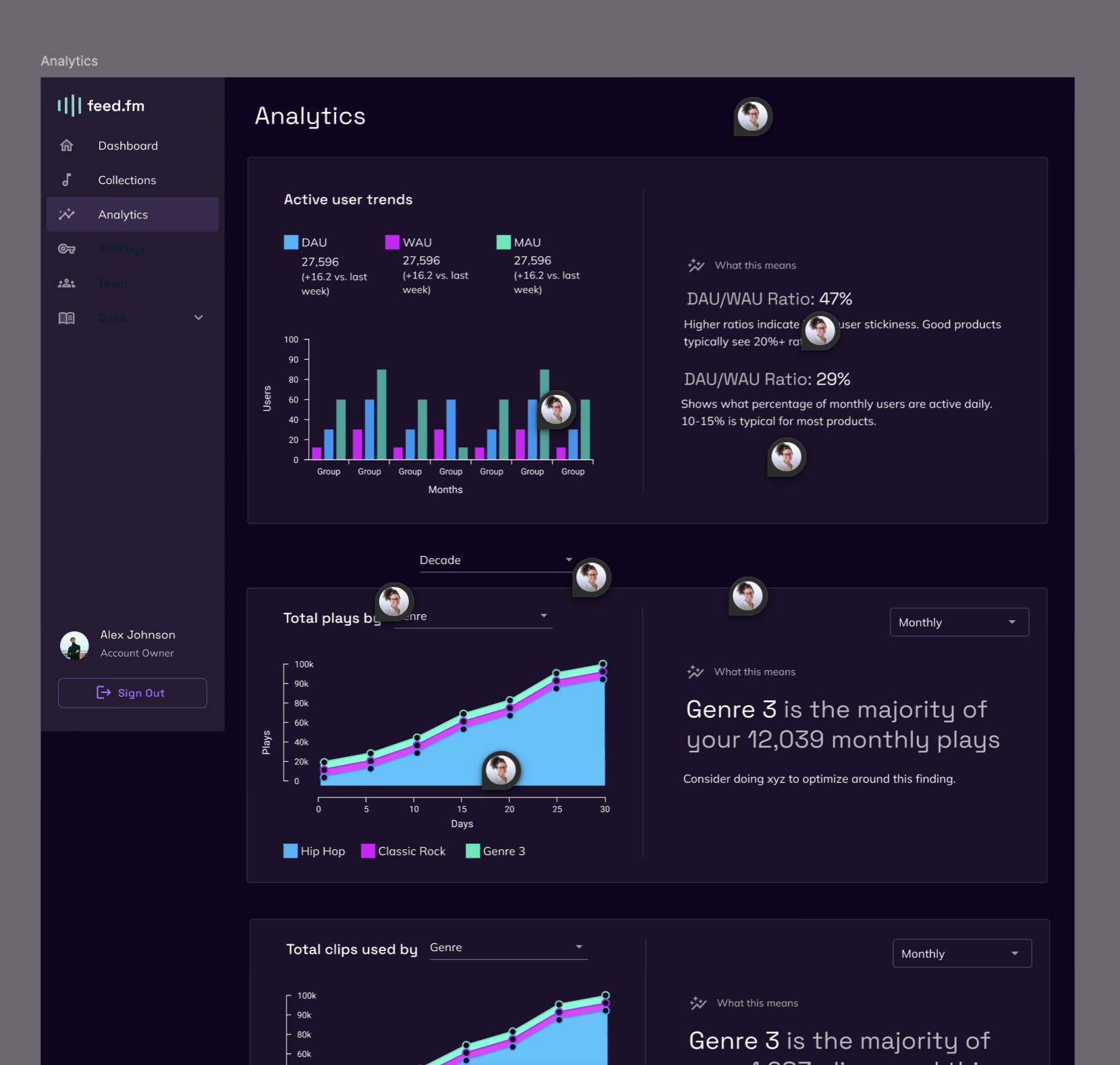
One of many analytics dashboard concepts explored—showcasing the overwhelming variety of metrics, charts, and data points that stakeholders wanted to include
Connecting with Claude
To systematically evaluate different measurement approaches and prioritize them based on what data we already had access to I asked Claude to outline all of the possible ways we could measure Clips. I chatted with the PM about prioritization. It turns out we had access to data from two categories, two categories were out of scope technically, and the final two were out of scope for the project. After this exercise I felt confident we were covering our bases and starting with the simplest implementation.
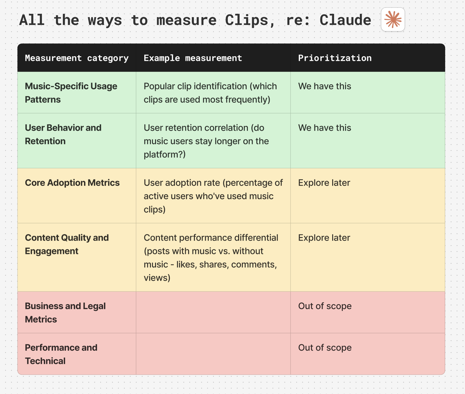
Using Claude to systematically evaluate all possible measurement approaches and prioritize them based on available data and project scope
Simplicity first
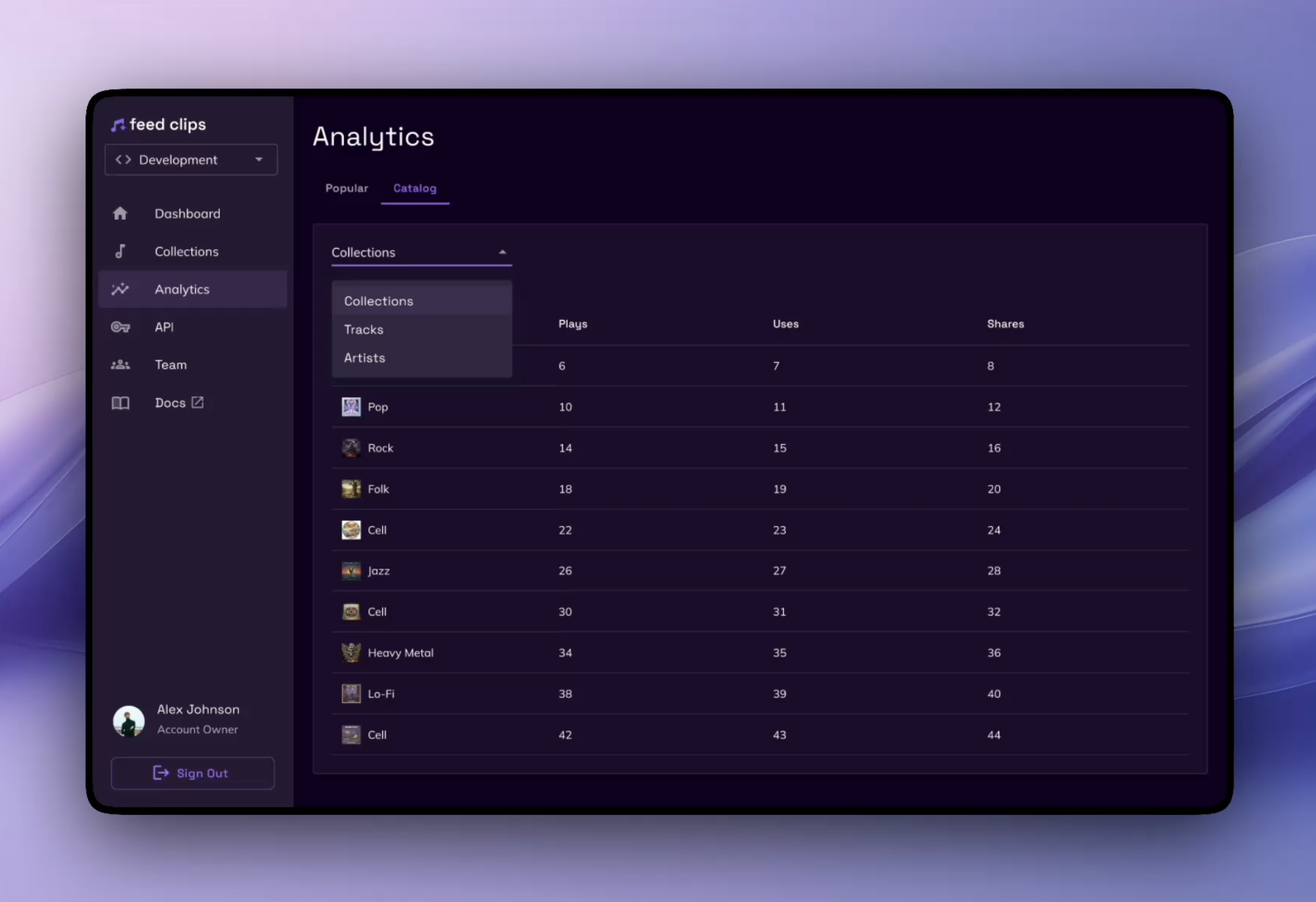
After a lot of brainstorming about charts and graphs, I landed on the MVP including a simple table of a user's clips, along with plays, uses, and likes. The fancy visuals can come after we validate what metrics actually matter to our users. This approach allowed us to focus on core functionality while keeping the interface clean and understandable.
The initial MVP analytics view with a straightforward table displaying collection metrics
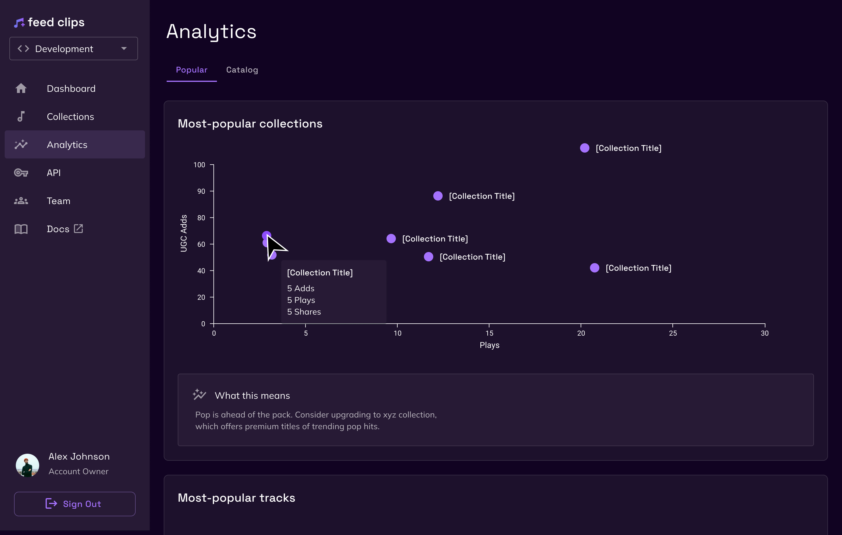
Future iteration with data visualizations and charts to provide deeper insights into collection performance
Takeaways
If I were to do things over, I would have skipped out on refining a light mode and dark mode. While it was built into MUI, it still required some time and effort to properly implement and polish. Forgoing this effort would have resulted in a quicker time to market and faster user insights. I look forward to refining the analytics offerings based on real user data and feedback, allowing us to build features that truly matter to our stakeholders rather than assumptions about what they might want.