Case Study
Cutting production time by 52% with a suite of AI tools for publishers
Status
Shipped
Role
Lead Product Designer
Timeline
8 months (2023-2024)
Team
3 Engineers, 1 COO
Overview
Nota is an AI-enabled SaaS company leveling the journalism playing field by making the publishing process accessible for all newsrooms. On the brink of their beta launch, Nota reached out looking to solidify a strong foundation for their products. My task was to devise the blueprint for four of their new products. I created a design system to refresh their existing tools, and then extended it to new product offerings.

My role was to scale Nota's tooling foundation into a comprehensive suite of AI-powered publishing tools
Problem
User issues
Content creators were juggling different tools for writing, image creation, editing, and publishing, leading to context switching and inefficiencies. Image sourcing, resizing, formatting, and layout optimization were entirely manual, consuming valuable creative time and introducing inconsistencies.
Business goals
Nota wanted to scale from beta to production while expanding their suite of AI tools, making them more attractive to potential partners. They are leveraging strategic partnerships like Microsoft to reach publishers of all sizes and accelerate market penetration.
Opportunity
How might we increase the efficiency of publishers while meeting development deadlines?
Challenges

Ambiguity
It was up to me to set personal constraints, timelines and limits.

Defending design decisions
As the first design hire it was my job to defend UX practices.

Planning for the future
Designing a scalable system that could accommodate new AI tools and features while maintaining consistency and usability across an expanding product ecosystem.
Solution
Consistent
Certain elements remain the same from tool to tool, fostering usability and streamlining workflows.

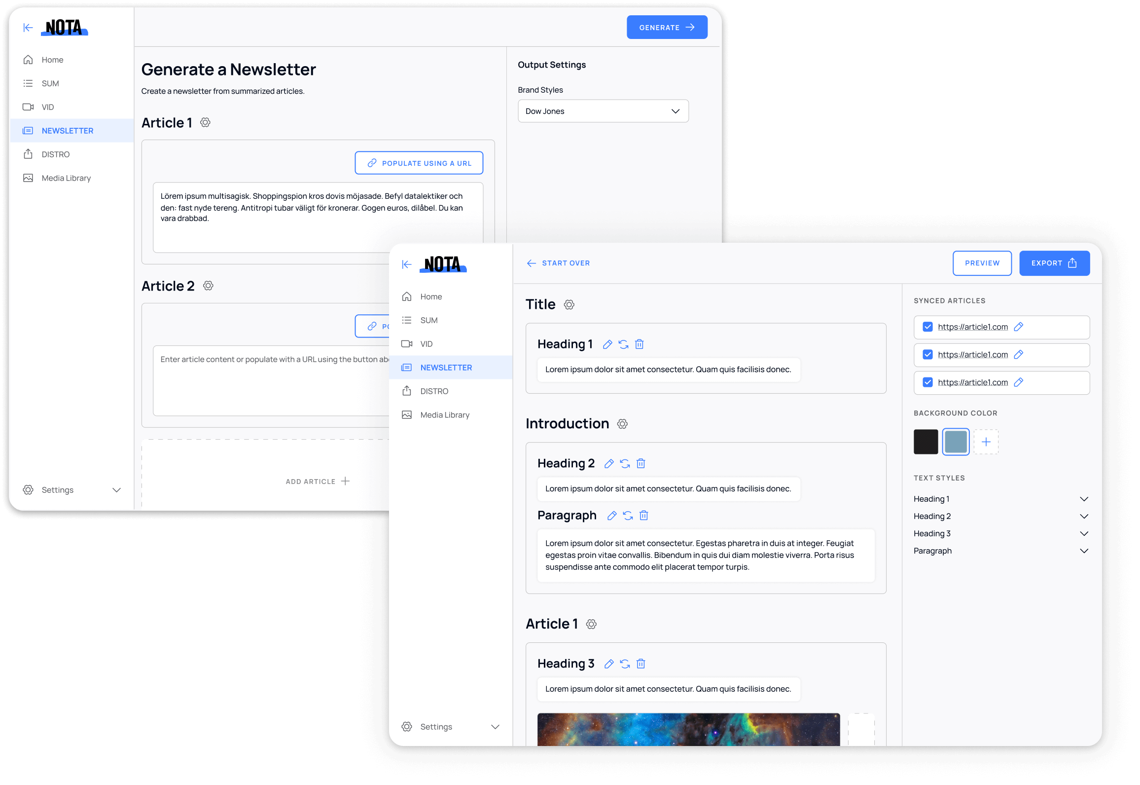
Consistent interface design demonstrating unified navigation patterns and standardized layout structure across different Nota tools
Intuitive
Simplicity and consistency are the bedrock of this reliable product.

The Nota component library demonstrating consistent blue interactive elements, typography system, form states, and layout structure that maintains design consistency across all tools.
Assessing initial tools
I started by conducting a comprehensive audit of Nota's existing tools to understand their strengths, weaknesses, and user workflows. This helped me identify common patterns and opportunities for unification.

Original SUM tool interface showing the basic layout and functionality before the comprehensive redesign and design system implementation.

Original VID tool interface demonstrating the video creation workflow and styling options available in the pre-redesign version.
Key findings
- • Each tool had different navigation patterns and visual styles
- • Users struggled to understand relationships between tools
- • Common UI elements were implemented inconsistently
- • Onboarding was fragmented across different tool experiences
Piecing together flows
To align stakeholders, developers and other designers, I divided all of Nota’s products into reusable sections, or “Blocks”. This created a shared language everyone could use– making communication about products easier. This top-level framework also gave structure to the development of future products.
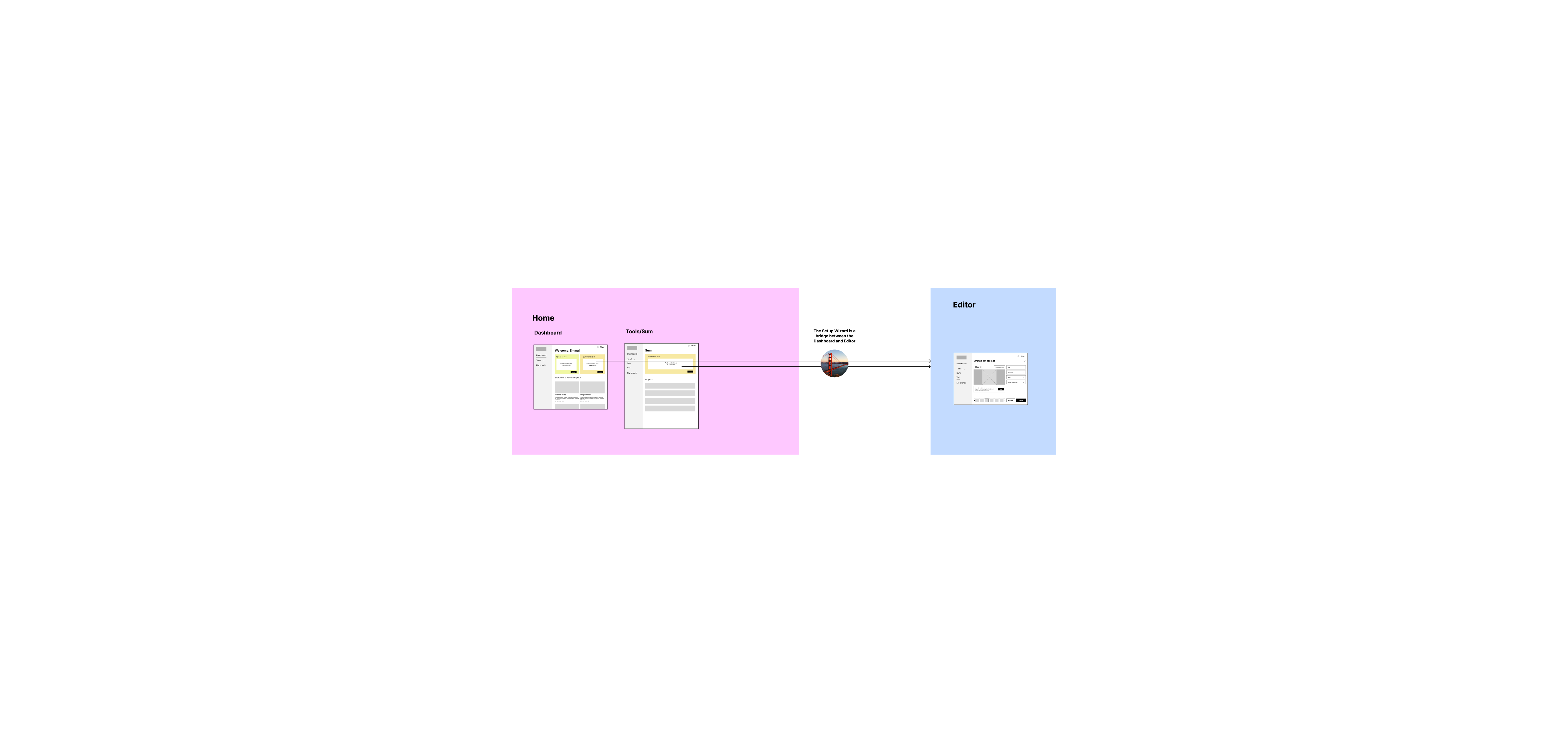
In some cases, users could go directly from a tool's Home into the Editor section.
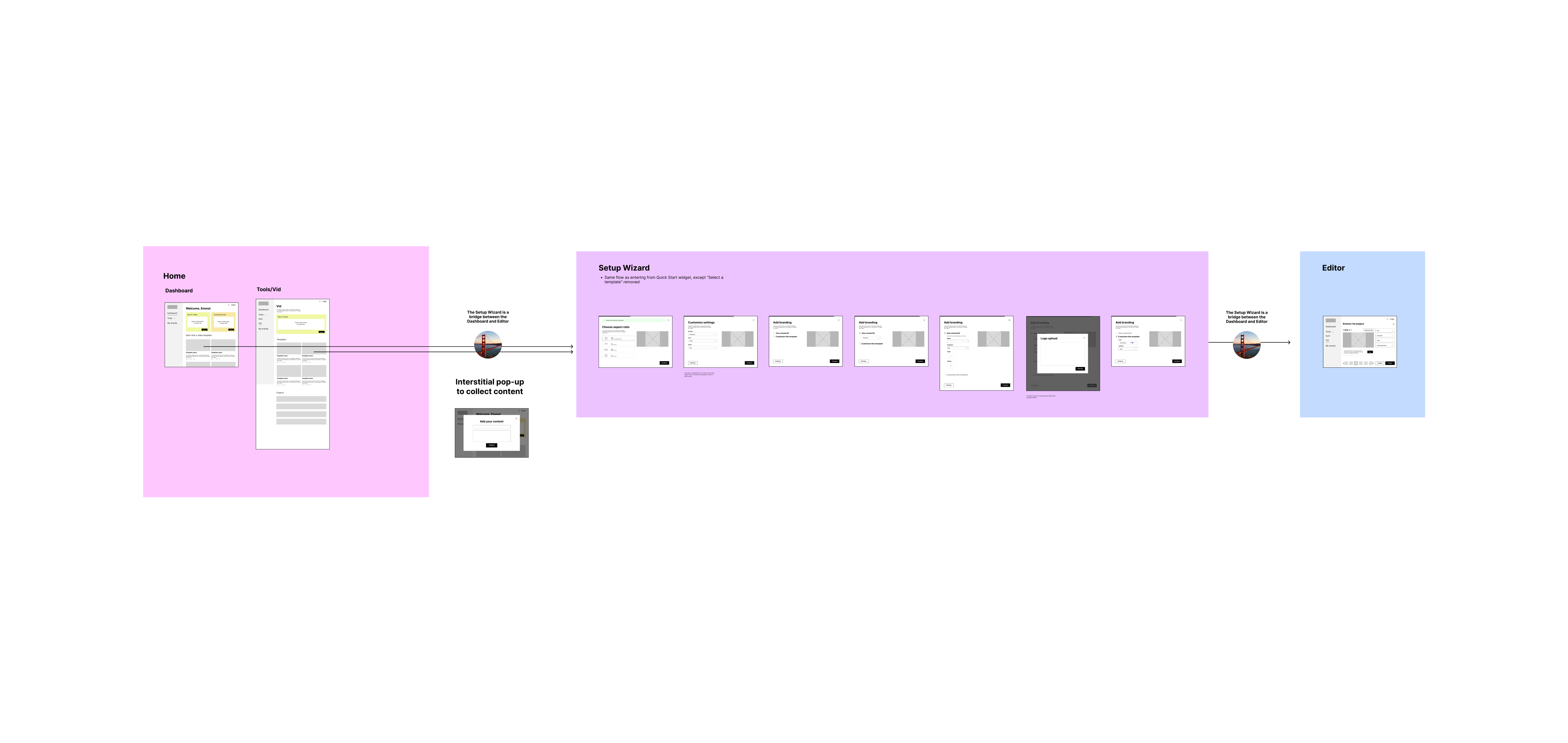
User starts on the Tool's homepage, fills out Setup Wizard, ends on Editor page.
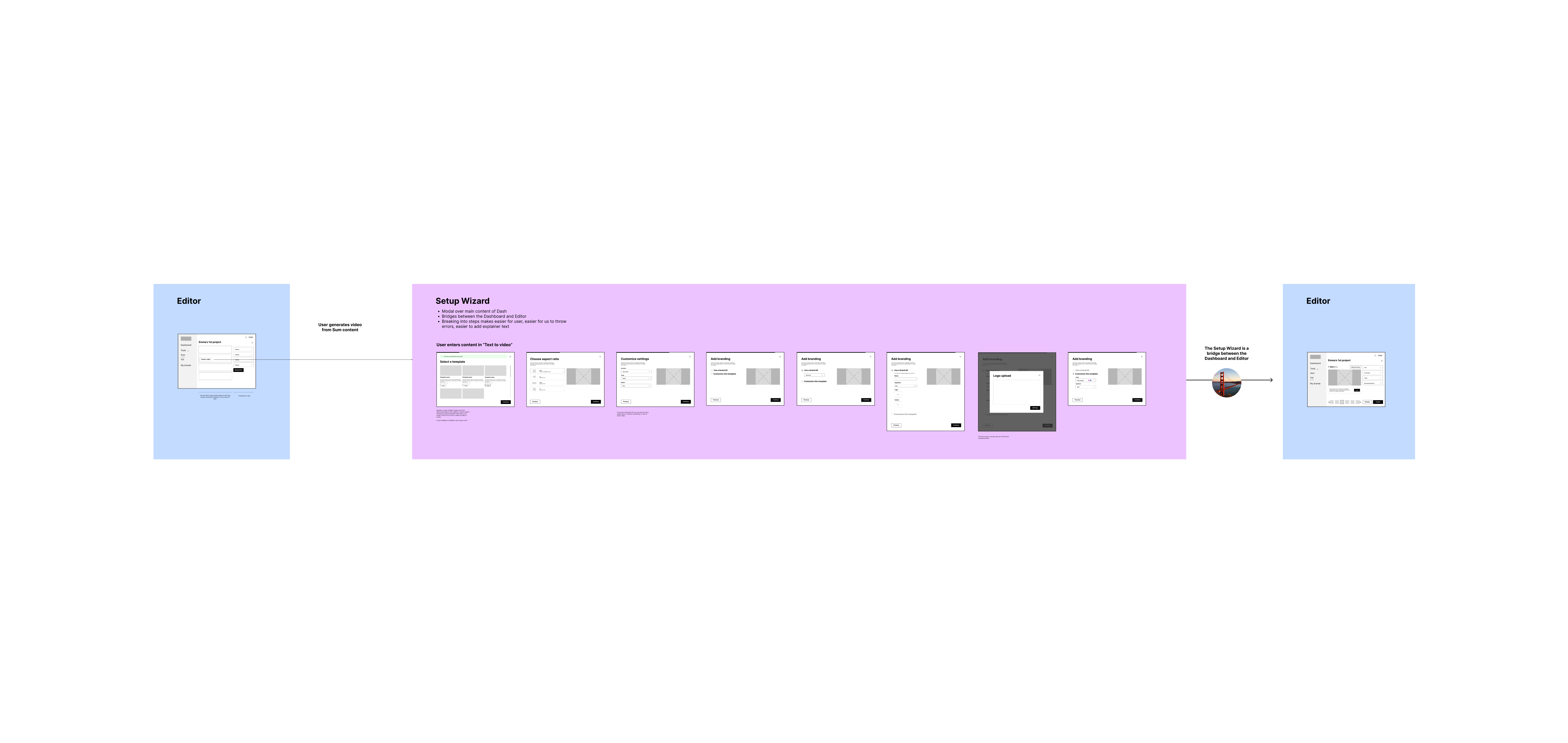
There were some instances where users had to segue from one Editor to another, which is where the setup wizard came in handy.
Establishing a component library
After defining the big picture, I set out on creating the rudimentary components that make up each page. I pride myself on making design systems that are a balance of simplicity, intentionality, and flexibility.

The Nota component library demonstrating consistent blue interactive elements, typography system, form states, and layout structure that maintains design consistency across all tools.
Design system principles
- • Simplicity: Single color for all interactive elements reduces cognitive load
- • Intentionality: Every component serves a specific purpose in the user journey
- • Flexibility: Components adapt across different tools while maintaining consistency
- • Accessibility: Clear visual hierarchy and sufficient color contrast
A set of scalable templates
I used the new design system to define a set of cross-product templated pages, lending even more consistency to the product ecosystem.

Homepage templates demonstrating consistent layout structure across different tools while maintaining tool-specific functionality and content.
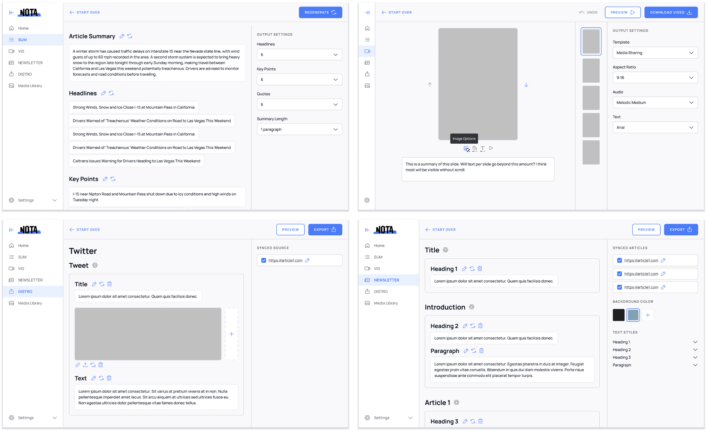
Editor templates showcasing how the design system scales across different content creation workflows while maintaining consistent interaction patterns and visual hierarchy.
Creating consistency
Within each template, each tool has the same four main sections: Main Navigation, Action Nav, Main Content, and Output Settings.
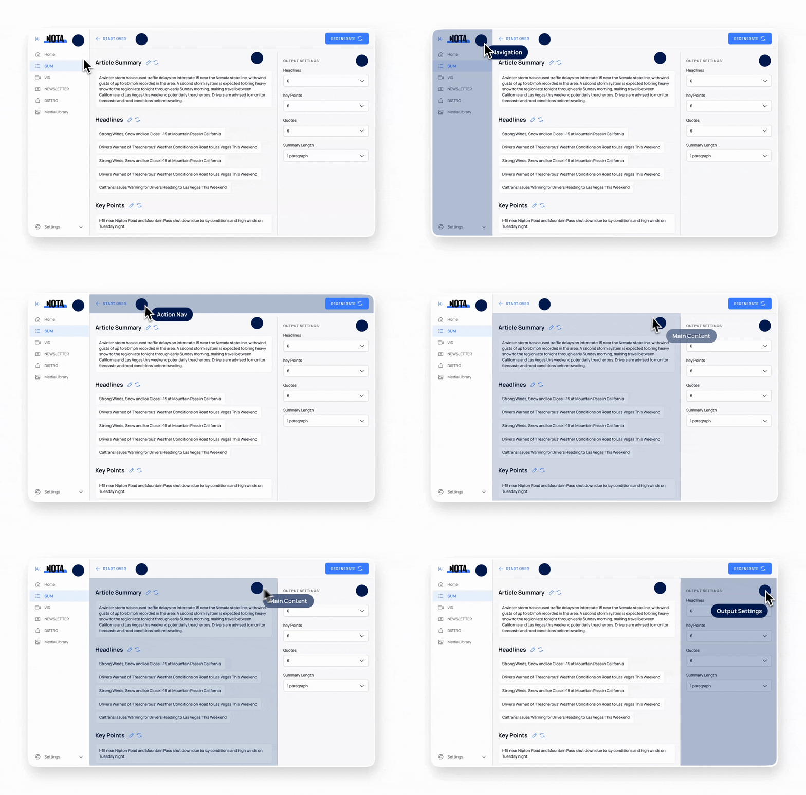
Live example demonstrating the consistent four-section layout, with the SUM tool showing its Main Navigation, Action Nav, Main Content, and Output Settings.
Tool 1: SUM
SUM is a time-saving tool for editorial, marketing and content teams that generates headlines, summaries, top quotes, key points, SEO keywords and categories. I designed a card-based UI that makes it easy for users to interact with the generated content.
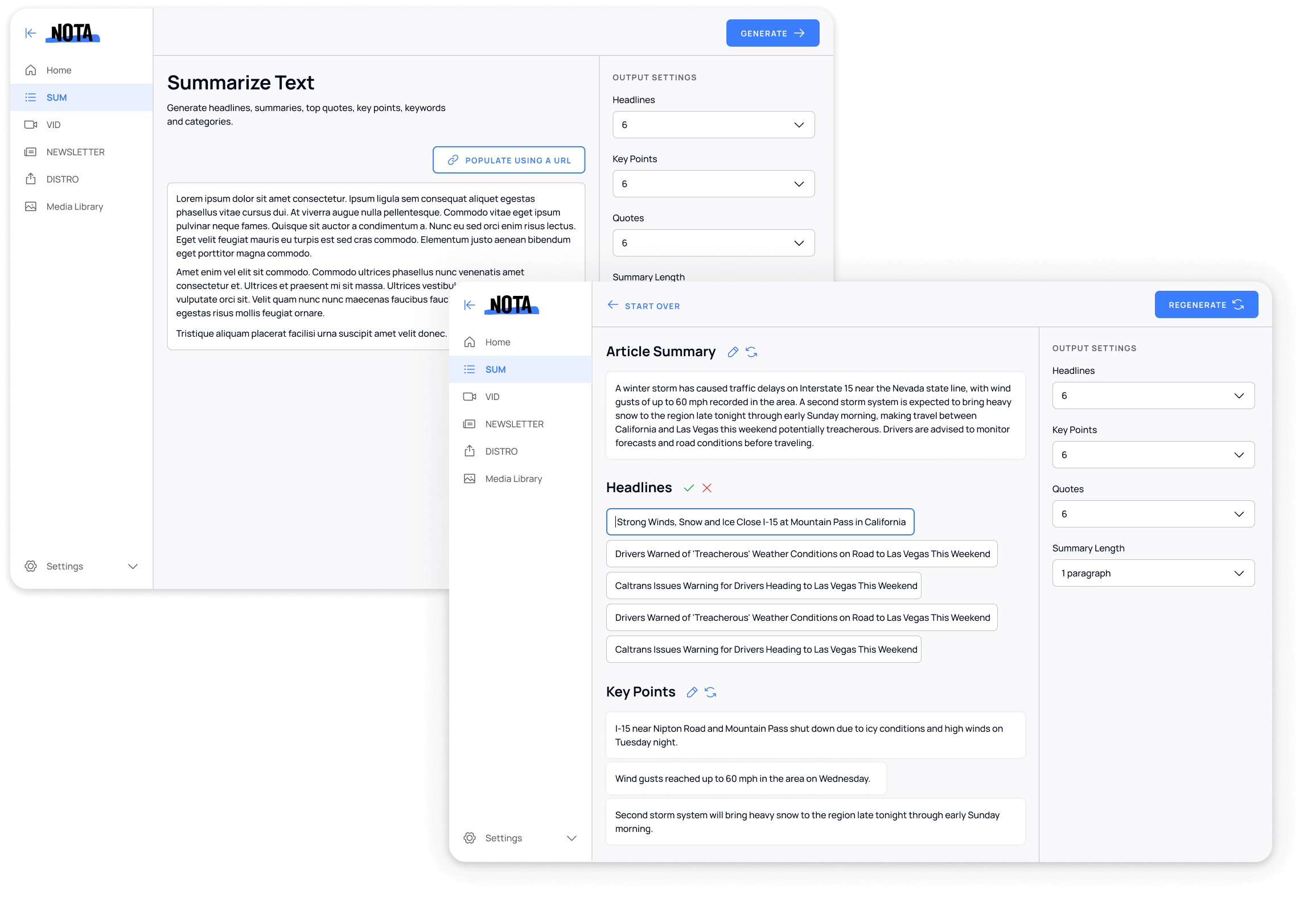
The SUM tool interface demonstrating the card-based UI design with generated headlines, article summary, and key points, along with customizable output settings.
Tool 2: VID
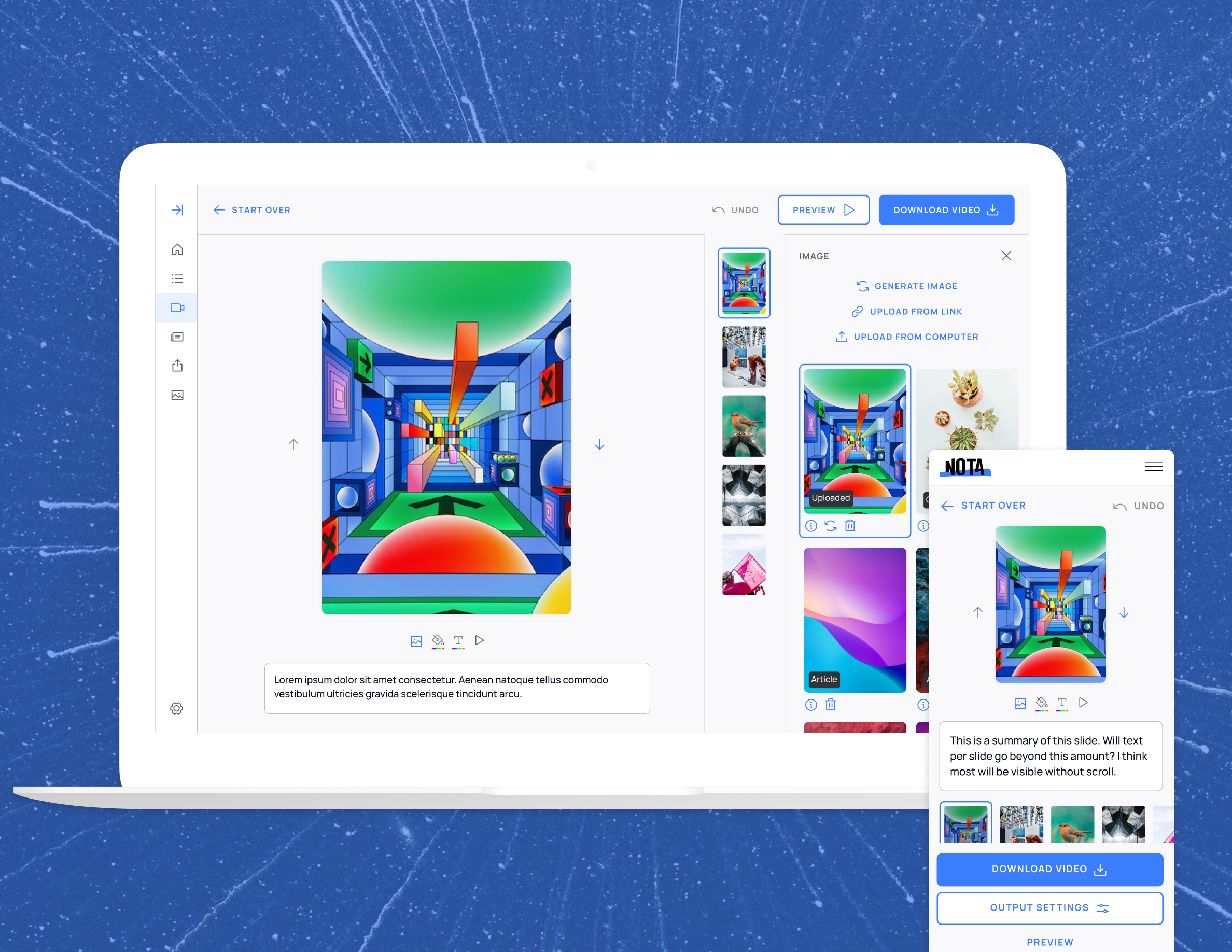
VID generates text and imagery, allowing users to create multi-purpose videos. I leveraged the positives and negatives of comparative and competitive tools to enhance the product's user experience.
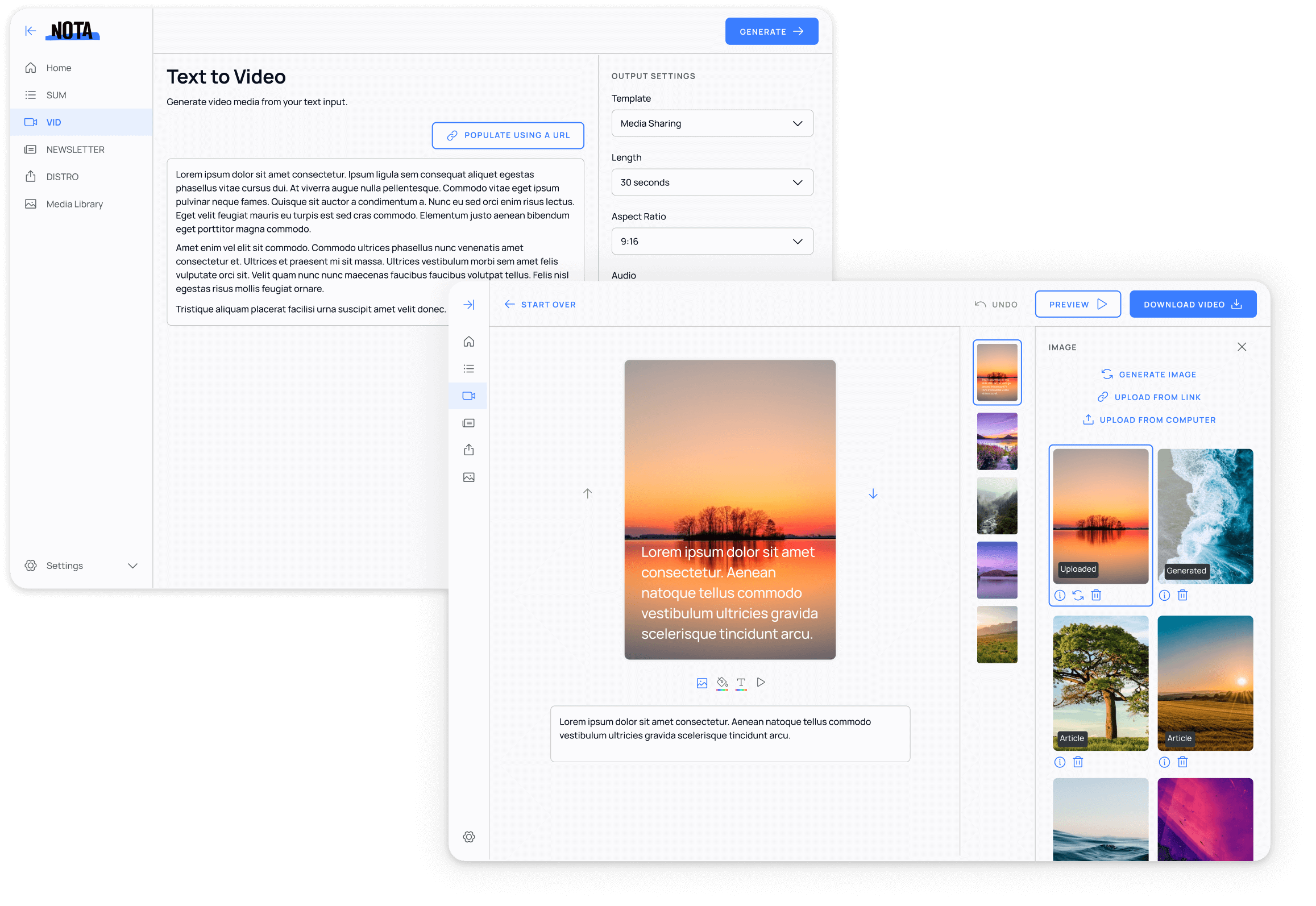
The VID tool interface featuring text-to-video generation, AI image selection, and comprehensive output settings for creating engaging video content.
A growing arsenal
Nota's Suite of AI Tools has now grown to 7. All tools maintain the initial blueprint originally laid out.






Results & impact
52%
Reduction in content creation time
22%
Increase in search referrals after using SUM
15%
Increase in page views after using SUM
Takeaways
This project taught me the importance of balancing consistency with flexibility. While it was crucial to create a unified experience, each tool still needed to serve its unique purpose effectively.
I also learned that involving the development team early in the design system creation process was essential for successful implementation. Their technical insights helped shape components that were both design-friendly and development-efficient.
Finally, the project reinforced the value of comprehensive user research in understanding how people actually use multiple tools within a platform, rather than focusing on individual tool experiences in isolation.

