Case Study
Capturing profit with music distribution platform analytics
Status
Shipped
Role
Lead Product Designer
Timeline
8 months (2023-2024)
Team
3 Engineers, 1 COO, me
Overview
Rostrum Records, a major record label with names like Mac Miller and Wiz Khalifa, approached my team with the goal of building a new music distributor. A true 0-1 design, I was tasked with taking the product from concept to final solution.

There's no party in "third-party"
Record labels were losing revenue to large music distributors who take substantial cuts from artists' earnings, creating a financial burden that reduced profitability for catalog owners.

UX issues (existing distributors)
Fragmented analytics
Existing platforms provided overwhelming amounts of raw data without actionable insights, making it difficult for labels to understand performance and make strategic decisions.
Complex release workflows
Multi-step release management processes were confusing and time-consuming, with inconsistent user experiences across different platforms and tools.
Difficulty tracking catalog
Users struggled to monitor release statuses, track performance across platforms, and get a comprehensive view of their music catalog's overall health.
Design challenges
0-1
It was up to me to set forth a blueprint for a brand new music distributor with no existing scaffolding.
Intricate user journeys
Workflows included multi-step upload flows and monitoring the statuses of releases.
Ever-changing statuses
I was tasked to design a tool that took into account several complex states and statuses for pages and components.
Solution
User-centered
SpaceHeater is not tech company telling users what to want out of a distributor. It's centered around catalog owner needs.

Streamlined data
SpaceHeater gets to the root of what analytics record labels and catalog owners need to do their jobs.

Shows... and tells
SpaceHeater is not only a suite of analytics... it's a recommendation engine. It can goes beyond the graphs and focuses on action.

Surveying the landscape
To kick off the project, I launched an extensive discovery phase during which I analyzed existing music distributors. I summarized findings and noted key observations in a presentation for stakeholders. The findings influenced product direction.

Information architecture of one of SpaceHeater's competitors, Opus

I documented the pages of each competitor with screenshots and detailed notes
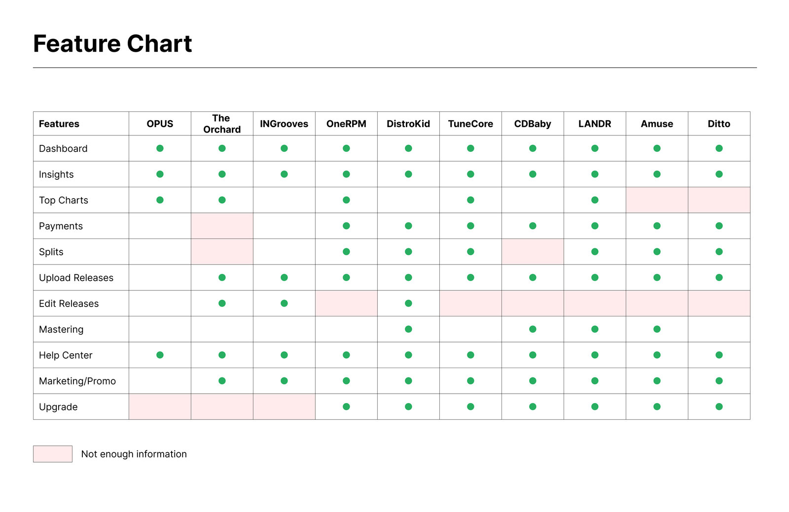
Feature comparison matrix mapping capabilities across major music distribution platforms to identify gaps and opportunities for SpaceHeater
Key observations
- • Inconsistent panel positioning across different tools
- • No shared navigation patterns or interaction models
- • Lack of unified visual language and component library
- • Different information hierarchies creating user confusion
Opportunities
Opportunity 1: Actionable insights
A big theme of SpaceHeater is going beyond analytics, and "telling" rather than only "showing".
Competitors...
Competitors overwhelm users with complex charts and raw data, leaving them to interpret metrics and make decisions without guidance.
SpaceHeater...
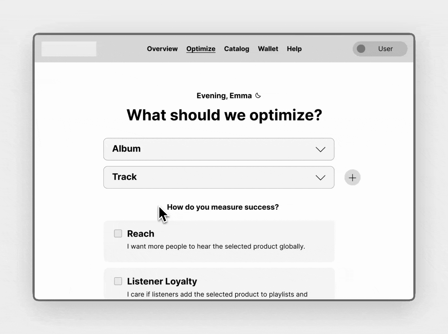
SpaceHeater asks users what they want to optimize and how they measure success, providing clear, actionable guidance instead of raw data dumps.
Opportunity 2: Lessen fatigue
Music release management involves complex, multi-step workflows that can overwhelm users. SpaceHeater addresses this by breaking down complicated processes into manageable phases with clear guidance and progress indicators.
Competitors...

Traditional music distribution platforms present users with overwhelming multi-step workflows without clear guidance or progress indicators.
SpaceHeater...
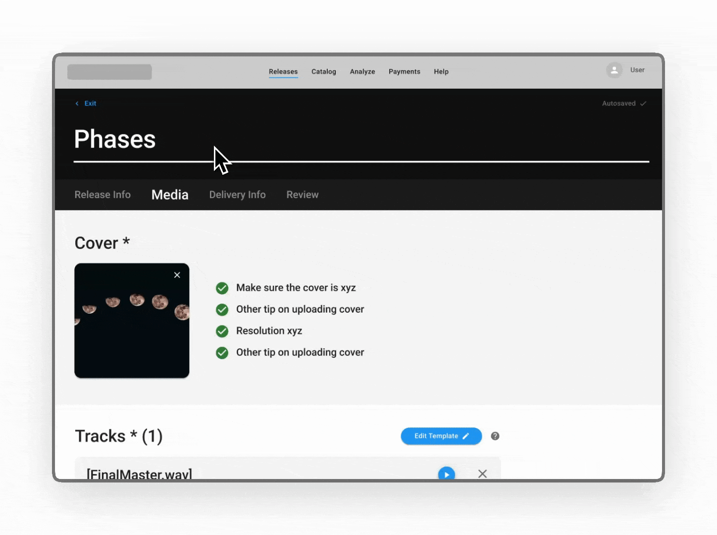
SpaceHeater organizes complex workflows into clear phases with contextual guidance, helpful tips, and progress indicators to reduce cognitive load and user fatigue.
Opportunity 3: A streamlined tool
Competitor distributors are bloated with marketing tools. SpaceHeater won't try and invent the wheel, instead focusing on providing seamless catalog management and insights.
Competitors...
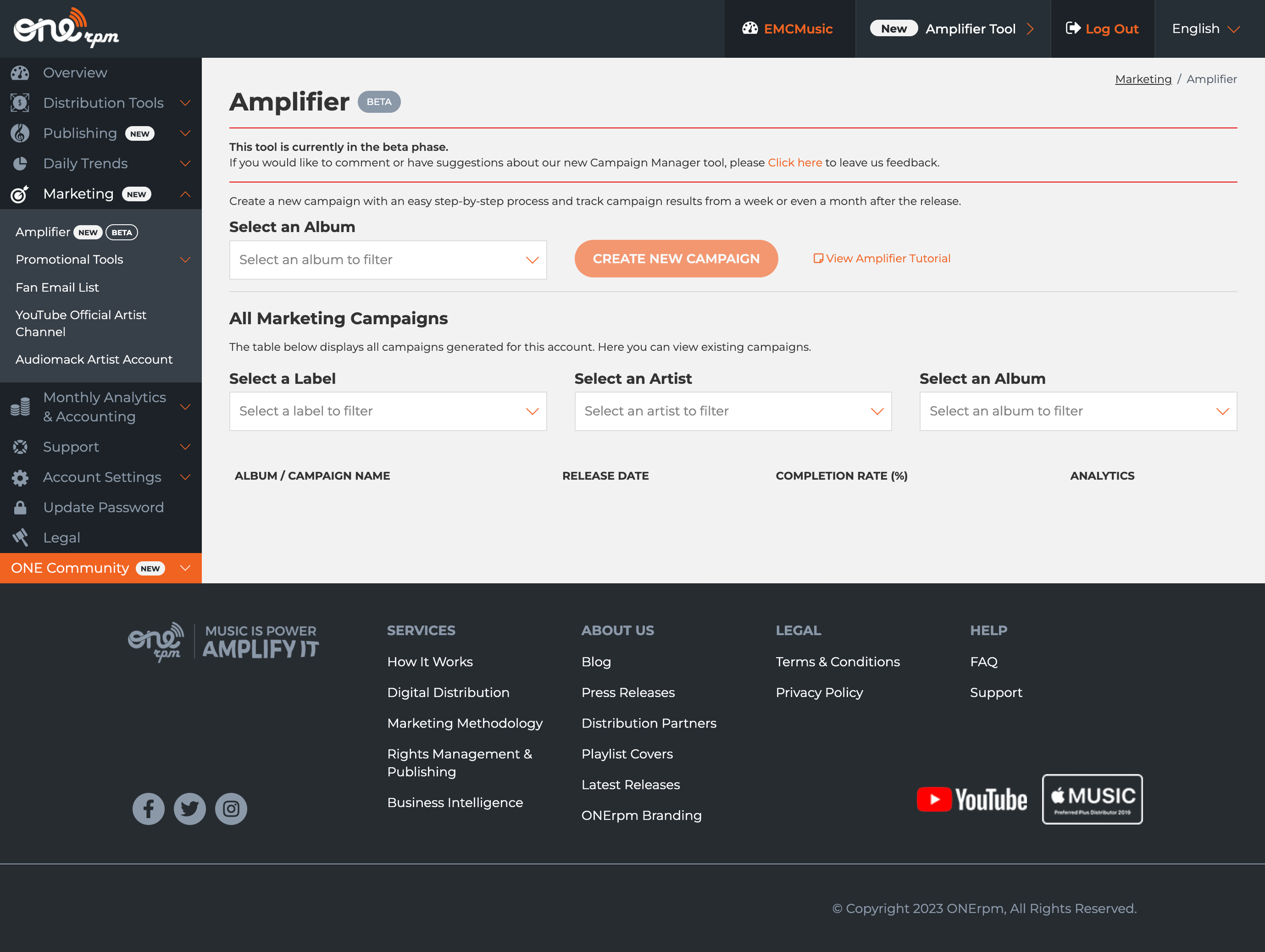
Competitor platforms like ONErpm overwhelm users with countless marketing tools, promotional features, and complex navigation, creating a cluttered experience that distracts from core music distribution functionality.
SpaceHeater...
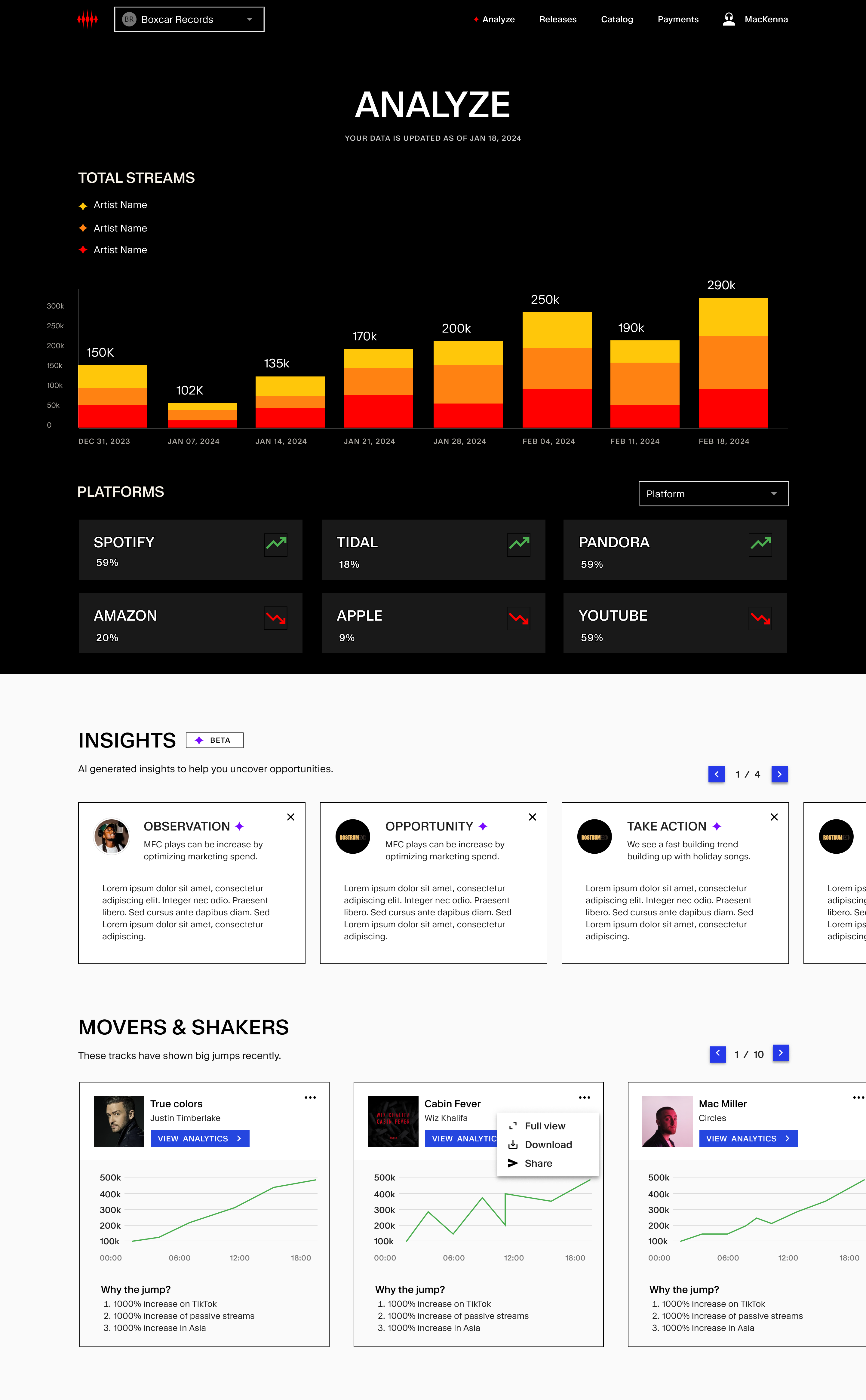
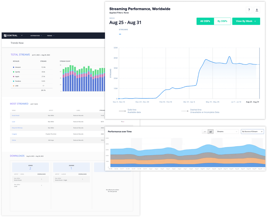
SpaceHeater's analytics interface demonstrates purposeful simplicity with clean data visualization, actionable AI insights, and focused functionality that helps users make informed decisions without overwhelming them with unnecessary features.
Choosing a component library
I decided to build designs using an existing component library, Google Material Design, rather than create one from scratch. This helped streamline designer/development hand-off, and allowed me to focus on solving the bigger-picture design challenges.

Google Material Design system providing comprehensive guidelines, components, and icons that enabled rapid prototyping and consistent implementation across the SpaceHeater platform.
Benefits of using Material Design
- • Faster development: Pre-built components reduced implementation time
- • Consistent patterns: Familiar interaction models for users
- • Accessibility built-in: Components follow WCAG guidelines by default
- • Cross-platform consistency: Unified experience across web and mobile
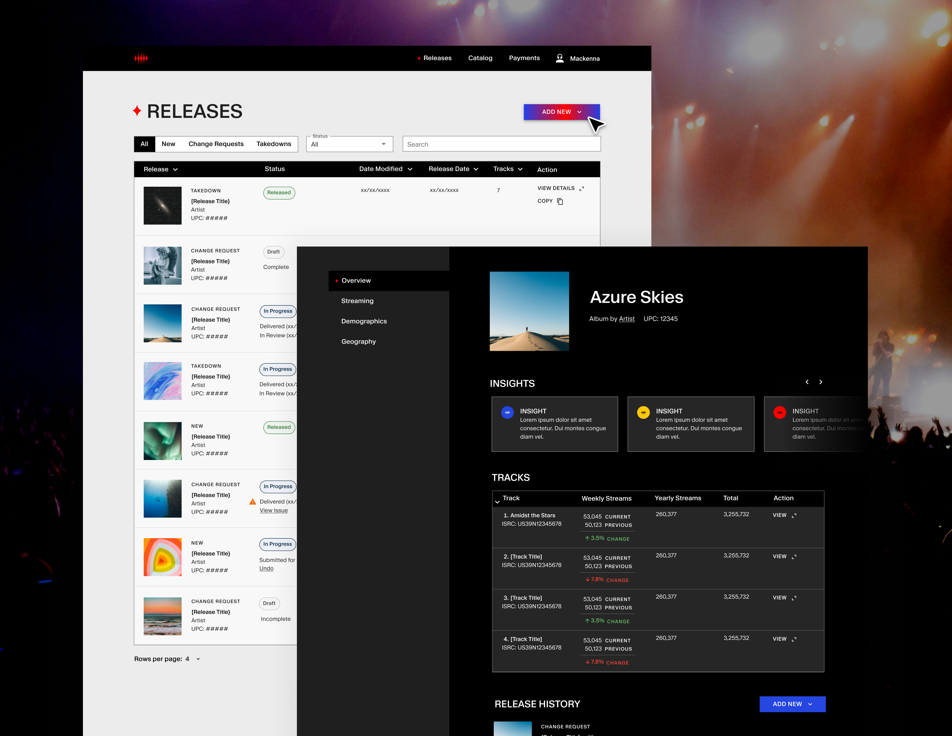
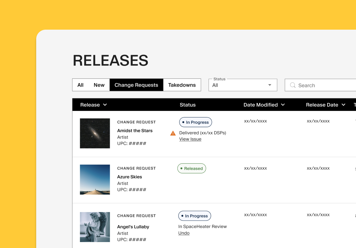
Validating designs
Users were unable to find change requests on the main releases page. It turns out change requests were actually a type of release, and could be categorized by the same statuses. I decided to combine change requests and releases into one table, and have them be paginated by type of release rather than status. Keeping in close communication with the client and testing early and often helped tame assumptions and center the design around users.
Before: Separate sections

Old releases page showing separate sections for releases and change requests
After: Combined table

New releases page showing combined table for releases and change requests
Navigating tech constraints
In one of our collaboration sessions, I received feedback from the development team that we could speed up production time by eliminating modals in the product. I didn't see this as a huge hinderance to user experience, and found a solution.
Mid-fidelity (modal)

Initial design approach using modal overlays for release configuration, which required additional development complexity and time to implement properly.
High-fidelity (in screen)

Final design solution integrating the same functionality directly into the main interface with sidebar navigation, eliminating modal complexity while maintaining user experience and workflow efficiency.
Creating rhythm within pages
Record labels have to input album information and provide audio files and delivery information before they release an album. Existing upload flows do not organize content in a thoughtful manner with attention to user experience, so I capitalized on this gap in the market.
Within each page of the upload flow, I categorized form fields into two groups: Primary and Details. Primary form fields must be filled out in order to release an album, and "Detail" form fields are optional. This hierarchy expedites filling out information for releases.
Primary content

Primary form fields highlighted in teal include essential release information that must be completed before an album can be distributed, creating a clear hierarchy for users.
Secondary content

Secondary "Details" fields highlighted in teal contain optional metadata and additional information that can enhance the release but don't prevent users from completing the upload process.
A fluid experience
Competitor's upload flows are rigid, requiring users to fill out all form fields on a page before moving to the next step. We designed an upload flow that allows users to move freely from page to page, autosaving information as they go. Users can review missed fields and errors on the review page of the flow.
Error correction

Competitor's upload flows are rigid, requiring users to fill out all form fields on a page before moving to the next step. We designed an upload flow that allows users to move freely from page to page, autosaving information as they go. Users can review missed fields and errors on the review page of the flow.
Freedom to skip

Users can skip certain sections and return to them later.
Streamlining intricate forms
Simplicity in color choice helped to focus user attention on completing complex flows.


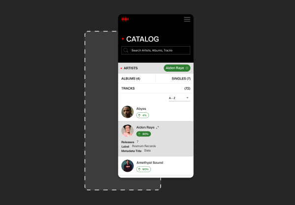
A browsable catalog of music
By interviewing catalog owners we uncovered their need to see as much of their catalog as possible at one time to glean its overall health. We looked to WINAMP, the classic early 2000s media software, as design inspiration for the platform's catalog, adding to data scan-ability.


Minimalist analytics
One of my tasks was to design a style guide for the platform's suite of analytics tools. To prevent visual noise and allow the data to shine, I took a minimalist approach to UI design. Every element included in the interface has a function.
I modified the brand palette to create a color palette for data. The brand calls for the motif of fire, and I communicated this by crafting a quantitative palette that assigns larger values to warmer colors.

Main analytics dashboard featuring fire-themed color palette where warmer colors represent higher values, creating an intuitive visual hierarchy for data interpretation.

Alternative view of the analytics interface demonstrating the same minimalist, fire-themed data-visualisation system across multiple chart types.
Actionable AI insights
A differentiator of the SpaceHeater platform is it not only show analytics about one's catalog, it incorporates actionable AI insights on how to act upon data. Following the UX principle of Jakobs Law, I applied light "AI-infused" branding to the platform when that technology was used.


Pioneering music distribution
The product was launched early 2025 to critical praise. Using the design system set forth the team was able to integrate new AI functionality into the experience to further elevate it for catalog owners.

LinkedIn announcement from Sureel AI highlighting SpaceHeater's groundbreaking integration of AI-powered attribution for music rights, marking a new standard in music analytics and transparency.

Industry press coverage of SpaceHeater's launch, featuring Rostrum Pacific CEO Benjy Grinberg
Industry press coverage of SpaceHeater's launch, featuring Rostrum Pacific CEO Benjy Grinberg and demonstrating the platform's reception in music industry publications.
Takeaways
This was one of my earlier experiences implementing Google's Material UI component library. While the decision to use an established design system accelerated development, I learned valuable lessons about the importance of maintaining design-development alignment throughout the process.
In retrospect, I realized I wasn't properly updating the library's design tokens and variables in Figma, which potentially created friction during the handoff process. The disconnect between my design files and the actual MUI implementation may have led to inconsistencies and additional development time. For future projects involving component libraries, I know to invest in the official Figma kit that allows proper variable manipulation and ensures seamless design-to-code workflows.
If I could approach this project differently, I would have conducted preliminary user interviews with catalog owners and music industry professionals before diving into the design phase. While our client's experience with music distributors provided valuable insights, direct user research would have given us a more comprehensive understanding of pain points and user needs. This would have helped validate our assumptions earlier and potentially uncovered additional opportunities we might have missed.